Introduction
Back in 2020 we got new views to draw grids in SwiftUI (LazyVGrid and LazyHGrid). Two years later, we are getting yet another view to display views in a grid (Grid). However, these new addition is very different, not only in the way you use it, but also how it behaves internally. The views from 2020, were lazy. These new ones are eager.
Lazy grids do not render or even instantiate views that are off-screen. The cell views are created only when they are scrolled in, and stopped being computed as soon as they scroll out. For more details check my 2020 article: Impossible Grids with SwiftUI.
Eager grids, the topic of this post, are the opposite. SwiftUI does not care if they are on or off screen. All views are treated the same. This may present a performance problem with a very large number of cells. However, how much is a very large number is an impossible question to answer. That will depend on the complexity of your cell views.
So if lazy grids perform better, it begs the question, why would I use eager grids? The truth is eager grids have their benefits over lazy grids and viceversa. For example, eager grids support column spanning, and lazy grids do not. Bottom line, performance is not the only factor to account for. In this article we will explore these new grids so you can make a good informed decision when choosing one over the other.
A Word on Container Views
Before we start exploring the Grid view, let me talk about container views in general. That is, views that receive a view builder and present its contents in a specific way (HStack, VStack, ZStack, Lazy*Grid, Group, List, ForEach, etc.). Bear with me, this will be helpful later.
There are two types of container views. I don’t think these types have an official name. I will just call them “Containers with layout” and “Containers without Layout”. This is better explained with a few examples:
struct ContentView: View {
var body: some View {
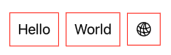
HStack {
Group {
Text("Hello")
Text("World")
Image(systemName: "network")
}
.padding(10)
.border(.red)
}
}
}This is equivalent to writing:
struct ContentView: View {
    var body: some View {

        HStack {
            Text("Hello")
                .padding(10)
                .border(.red)

            Text("World")
                .padding(10)
                .border(.red)

            Image(systemName: "network")
                .padding(10)
                .border(.red)
        }
    }
}
As you can see from the example, the Group modifiers are applied to each contained view separately. Also, the Group view by itself did not provide any layout nor does it have any geometry of its own. All layout is performed by its parent: the HStack.
Modifiers on a container with layout (such as HStack) however, are applied on the container, which does have its own geometry:
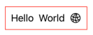
struct ContentView: View {
    var body: some View {

        HStack {
            Text("Hello")
            Text("World")
            Image(systemName: "network")
        }
        .padding(10)
        .border(.red)
    }
}
You may ask, what happens when the Group has no parent. That’s not a problem. When no layout container is present, SwiftUI implicitly uses a VStack. That’s why this also works:

struct ContentView: View {
    var body: some View {
        Text("Hello")
        Text("World")
        Image(systemName: "network")
    }
}
Another example of a container without layout is ForEach:
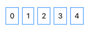
struct ContentView: View {
    var body: some View {

        HStack {
            ForEach(0..<5) { idx in
                Text("\(idx)")
            }
            .padding(10)
            .border(.blue)
        }
    }
}
What does this have to do with grids? We’ll find out in the next section.
Our First Grid
Let’s build our first grid. The syntax is very straight forward. You use a Grid container view, and then you define its rows by grouping the cell views inside a GridRow container.
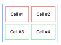
struct ContentView: View {
    var body: some View {
        Grid {
            GridRow {
                Text("Cell #1")
                    .padding(20)
                    .border(.red)

                Text("Cell #2")
                    .padding(20)
                    .border(.red)
            }

            GridRow {
                Text("Cell #3")
                    .padding(20)
                    .border(.green)

                Text("Cell #4")
                    .padding(20)
                    .border(.green)
            }
        }
        .padding(10)
        .border(.blue)
    }
}
Here is where our talk about containers comes into play. What if I tell you that Grid is a container with layout, but GridRow is not. This means we can rewrite our code and obtain the same result:
struct ContentView: View {
    var body: some View {
        Grid {
            GridRow {
                Text("Cell #1")

                Text("Cell #2")
            }
            .padding(20)
            .border(.red)

            GridRow {
                Text("Cell #3")

                Text("Cell #4")
            }
            .padding(20)
            .border(.green)
        }
        .padding(10)
        .border(.blue)
    }
}
Note that it is NOT a requirement that all rows have the same amount of cells. Although most examples here do, each row can have as many cells as you want.
Exploring Grid Options
In the following sections we will explore the different Grid sizing, alignment, and spanning options. But to make things easier, I have created a small app called Grid Trainer. The app let you play with all these grid parameters interactively. As you change the grid, the app will also show you the code that produces the grids you created.
The whole app is in a single swift file, so it only takes a few seconds to set it up. Just create a new Xcode project, replace your ContentView.swift file with the one in this gist file and you’re good to go. Note that although I mainly designed the app with macOS in mind, the app works smoothly on iPad too. No changes needed.
As you read the following sections, it is a good idea to run the Grid Trainer app and test your understanding of grids. Try to see if you can predict what the grid will do as you change parameters. Every time you get a different result of what you expect, you’ll learn something new about the grids. And if you get what you expect, you will reaffirm what you already know.
Spacing
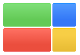
Similar to HStack and VStack, the Grid container has a vertical and horizontal parameter for spacing. If left unspecified, a system default will be used instead.
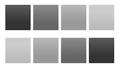
Grid(horizontalSpacing: 5.0, verticalSpacing: 15.0) {
    GridRow {
        Rectangle().fill(Color(white: 0.20).gradient)

        Rectangle().fill(Color(white: 0.40).gradient)

        Rectangle().fill(Color(white: 0.60).gradient)

        Rectangle().fill(Color(white: 0.80).gradient)

    }
    .frame(width: 50.0, height: 50.0)

    GridRow {
        Rectangle().fill(Color(white: 0.80).gradient)

        Rectangle().fill(Color(white: 0.60).gradient)

        Rectangle().fill(Color(white: 0.40).gradient)

        Rectangle().fill(Color(white: 0.20).gradient)
    }
    .frame(width: 50.0, height: 50.0)
}
Column Width, Row Height
The cells in a grid are views, and views adapt to the size a parent offers. In this case the parent, is the grid. In general, columns are as wide as the widest cell in it. In the example below, the orange column width is determined by the cell in the second row, which is the widest. The same happens for height. In the example, the second row is as high as the purple cell, which is the highest in the row.
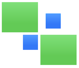
Unsized Cells
By default, the grid will offer as much space as possible to cells. So what would happen if a grid is made of a a Rectangle() view? As you know, shapes without a frame modifier like to grow to fill all the space offered by the parent. In such case, the grid will grow to fill all the space offered by its own parent.
In the example below, the green cell is not bound in its horizontal dimension, so it uses all available space. The grid grows as much as possible and the green cell fills the space. The blue cell however, is limited with a frame modifier to a 50.0 pt width. The dashed line shows the grid borders.
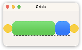
struct ContentView: View {
    let dash = StrokeStyle(lineWidth: 1.0, lineCap: .round, lineJoin: .miter, dash: [5, 5], dashPhase: 0)

    var body: some View {

        HStack(spacing: 0) {
            Circle().fill(.yellow).frame(width: 30, height: 30)

            Grid(horizontalSpacing: 0) {
                GridRow {
                    RoundedRectangle(cornerRadius: 15.0)
                        .fill(.green.gradient)
                        .frame(height: 50)

                    RoundedRectangle(cornerRadius: 15.0)
                        .fill(.blue.gradient)
                        .frame(width: 50, height: 50)
                }
            }
            .overlay { Rectangle().stroke(style: dash) }

            Circle().fill(.yellow).frame(width: 30, height: 30)
        }
    }
}
So far, nothing too surprising. This is the same behavior we’ve seen since day one with HStack containers. However, Grids offer us an option here. We can make the cell to refrain from making the grid grow for extra space. For example, for the horizontal dimension, the cell will only grow to take as much space as the widest cell in its column. Such cell will have no role in determining the column’s width. This is accomplished with the gridCellUnsizedAxes() modifier applied to the cell in question. It receives an Axis.Set value. It can be .horizontal, .vertical or a combination of both: [.horizontal, .vertical]. This tells the grid which dimension a given cell chooses to opt out of asking for additional space.
If you haven’t already, this is a good time to start playing with the Grid Trainer app and challenge your knowledge so far.
In the following example the red cell is unsized in the horizontal axis, making it grow only as large as the green cell. Even if the parent is offering more, the red cell will not take it.
Grid {
  GridRow {
    RoundedRectangle(cornerRadius: 5.0)
      .fill(.green.gradient)
      .frame(width: 160.0, height: 80.0)

    RoundedRectangle(cornerRadius: 5.0)
      .fill(.blue.gradient)
      .frame(width: 80.0, height: 80.0)
  }

  GridRow {
    RoundedRectangle(cornerRadius: 5.0)
      .fill(.red.gradient)
      .frame(height: 80.0)
      .gridCellUnsizedAxes(.horizontal)

    RoundedRectangle(cornerRadius: 5.0)
      .fill(.yellow.gradient)
      .frame(width: 80.0, height: 80.0)
  }
}Alignments
Grid Alignment
When a view for a cell is smaller than the available space, the alignment will depend on several parameters. The first parameter to consider, is the Grid(alignment: Alignment). It affects all cells in the grid, unless overridden by one of the next parameters. If left unspecified, it defaults to .center.
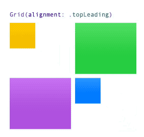
Grid(alignment: .topLeading) {
    GridRow {
        Rectangle().fill(.yellow.gradient)
            .frame(width: 50.0, height: 50.0)

        Rectangle().fill(.green.gradient)
            .frame(width: 100.0, height: 100.0)

    }

    GridRow {
        Rectangle().fill(.orange.gradient)
            .frame(width: 100.0, height: 100.0)

        Rectangle().fill(.red.gradient)
            .frame(width: 50.0, height: 50.0)
    }
}
Row Vertical Alignment
You may also specify a row alignment with GridRow(alignment: VerticalAlignment). Note that in this case, the alignment is only vertical. Cells in this row, will combine the Grid parameter, with the GridRow parameter. The row’s vertical alignment will have priority, over the grid’s vertical component of the alignment. In the example below, a grid with a .topTrailing value, combined with a .bottom vertical row value, results in a .bottomTrailing alignment for the cells in the second row. The other rows, will use the grids alignment (i.e., .topTrailing).

Grid(alignment: .topTrailing) {
    GridRow {
        Rectangle().fill(Color(white: 0.25).gradient)
            .frame(width: 120.0, height: 100.0)

        Rectangle().fill(Color(white: 0.50).gradient)
            .frame(width: 50.0, height: 50.0)

        Rectangle().fill(Color(white: 0.50).gradient)
            .frame(width: 120.0, height: 100.0)
    }

    GridRow(alignment: .bottom) {
        Rectangle().fill(Color(white: 0.25).gradient)
            .frame(width: 120.0, height: 100.0)

        Rectangle().fill(Color(white: 0.50).gradient)
            .frame(width: 50.0, height: 50.0)

        Rectangle().fill(Color(white: 0.50).gradient)
            .frame(width: 50.0, height: 50.0)
    }

    GridRow {
        Rectangle().fill(Color(white: 0.25).gradient)
            .frame(width: 120.0, height: 100.0)

        Rectangle().fill(Color(white: 0.50).gradient)
            .frame(width: 120.0, height: 100.0)

        Rectangle().fill(Color(white: 0.50).gradient)
            .frame(width: 50.0, height: 50.0)
    }
}
Column Horizontal Alignment
In addition to specifying a vertical row alignment, you may also specify a column horizontal alignment. As in the case of row alignments, this value will merge with the row vertical value and the grid’s alignment value. You indicate the column’s alignment with the modifier gridColumnAlignment()
NOTE: The documentation is very clear. gridColumnAlignment should only be used in one cell per column. Otherwise the behavior is undefined.
In the following example, you can see all alignments combined:
- Cell (1,1): Aligned
topLeading. (Grid alignment) - Cell (1, 2): Aligned
topTrailing. (Grid alignment + column alignment) - Cell (2,1): Aligned
bottomLeading(Grid alignment + row alignment) - Cell (2,2): Aligned
bottomTrailing(Grid alignment + row alignment + column alignment)
struct ContentView: View {
    var body: some View {
        Grid(alignment: .topLeading, horizontalSpacing: 5.0, verticalSpacing: 5.0) {
            GridRow {
                CellView(color: .green, width: 80, height: 80)

                CellView(color: .yellow, width: 80, height: 80)
                    .gridColumnAlignment(.trailing)

                CellView(color: .orange, width: 80, height: 120)
            }

            GridRow(alignment: .bottom) {
                CellView(color: .green, width: 80, height: 80)

                CellView(color: .yellow, width: 80, height: 80)

                CellView(color: .orange, width: 80, height: 120)
            }

            GridRow {
                CellView(color: .green, width: 120, height: 80)

                CellView(color: .yellow, width: 120, height: 80)

                CellView(color: .orange, width: 80, height: 80)
            }
        }
    }

    struct CellView: View {
        let color: Color
        let width: CGFloat
        let height: CGFloat

        var body: some View {
            RoundedRectangle(cornerRadius: 5.0)
                .fill(color.gradient)
                .frame(width: width, height: height)
        }
    }

}
Cell Alignment
Finally, you may also specify an individual alignment for a cell using the .gridCellAnchor(_: anchor: UnitPoint) modifier. This alignment will override any grid, column and row alignment for the given cell. Note that the parameter type is not Alignment, but UnitPoint. This means that in addition to using the predefined points .topLeading, .center, etc, you may also create arbitrary points, like UnitPoint(x: 0.25, y: 0.75):
Grid(alignment: .topTrailing) {
    GridRow {
        Rectangle().fill(.green.gradient)
            .frame(width: 120.0, height: 100.0)

        Rectangle().fill(.blue.gradient)
            .frame(width: 50.0, height: 50.0)
            .gridCellAnchor(UnitPoint(x: 0.25, y: 0.75))
    }

    GridRow {
        Rectangle().fill(.blue.gradient)
            .frame(width: 50.0, height: 50.0)

        Rectangle().fill(.green.gradient)
            .frame(width: 120.0, height: 100.0)

    }
}
Text BaseLine Alignment
In addition to the common alignments, remember you may also use text baseline alignments. Both for Grid and GridRow:
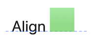
Grid(alignment: .centerFirstTextBaseline) {
    GridRow {
        Text("Align")

        Rectangle()
            .fill(.green.gradient.opacity(0.7))
            .frame(width: 50, height: 50)
    }
}
.font(.system(size: 36))
Rows without GridRow
If a Grid has a view outside of a GridRow container, it is used as a single cell row that spans all columns. A common use for this type of cell, is to create separators. For example, you could use a Divider() view, or something more complex as in the example below. Note that we usually do not want the divider to make the grid grow to its maximum, so we make the view unsized on the horizontal axis. This will make the divider as wide as the widest row, but not wider.
Grid(horizontalSpacing: 5.0, verticalSpacing: 5.0) {
GridRow {
RoundedRectangle(cornerRadius: 5.0).fill(.green.gradient)
RoundedRectangle(cornerRadius: 5.0).fill(.purple.gradient)
RoundedRectangle(cornerRadius: 5.0).fill(.blue.gradient)
}
.frame(width: 50.0, height: 50.0)
Rectangle()
.fill(LinearGradient(colors: [.gray, .clear, .gray], startPoint: .leading, endPoint: .trailing))
.frame(height: 2.0)
.gridCellUnsizedAxes(.horizontal)
GridRow {
RoundedRectangle(cornerRadius: 5.0).fill(.green.gradient)
RoundedRectangle(cornerRadius: 5.0).fill(.purple.gradient)
RoundedRectangle(cornerRadius: 5.0).fill(.blue.gradient)
}
.frame(width: 50.0, height: 50.0)
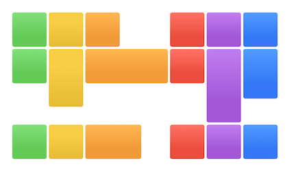
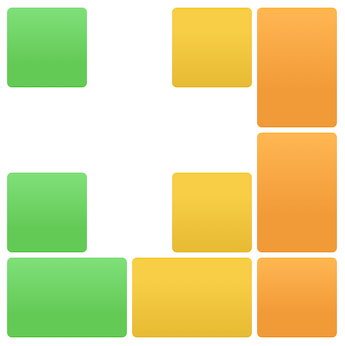
}Column Spanning
One of the advantages of eager grids over lazy grids, is that all cell geometries are always known. This makes it possible to have a cell that spans multiple columns. To configure a cell to span, use the .gridCellColumns(_ count: Int)
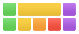
Grid {
GridRow {
RoundedRectangle(cornerRadius: 5.0).fill(.green.gradient)
.frame(width: 50.0, height: 50.0)
RoundedRectangle(cornerRadius: 5.0).fill(.yellow.gradient)
.frame(height: 50.0)
.gridCellColumns(3)
.gridCellUnsizedAxes(.horizontal)
RoundedRectangle(cornerRadius: 5.0).fill(.purple.gradient)
.frame(width: 50.0, height: 50.0)
}
GridRow {
RoundedRectangle(cornerRadius: 5.0).fill(.green.gradient)
.frame(width: 50.0, height: 50.0)
RoundedRectangle(cornerRadius: 5.0).fill(.yellow.gradient)
.frame(width: 50.0, height: 50.0)
RoundedRectangle(cornerRadius: 5.0).fill(.orange.gradient)
.frame(width: 50.0, height: 50.0)
RoundedRectangle(cornerRadius: 5.0).fill(.red.gradient)
.frame(width: 50.0, height: 50.0)
RoundedRectangle(cornerRadius: 5.0).fill(.purple.gradient)
.frame(width: 50.0, height: 50.0)
}
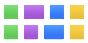
}Watch Out for Ambiguity
Consider the following example. We have 4 cells per row. Each cell is 50.0 pt wide, except for the second cell from the first row, and the third cell in the second row. These will grow as much as possible (without enlarging the grid). These two cells also span two columns each.
struct ContentView: View {
    var body: some View {
        Grid(horizontalSpacing: 20.0, verticalSpacing: 20.0) {
            GridRow {
                CellView(width: 50.0, color: .green)

                CellView(color: .purple)
                    .gridCellColumns(2)

                CellView(width: 50.0, color: .blue)

                CellView(width: 50.0, color: .yellow)
            }
            .gridCellUnsizedAxes([.horizontal, .vertical])

            GridRow {
                CellView(width: 50.0, color: .green)

                CellView(width: 50.0, color: .purple)

                CellView(color: .blue)
                    .gridCellColumns(2)

                CellView(width: 50.0, color: .yellow)
            }
            .gridCellUnsizedAxes([.horizontal, .vertical])
        }
    }

    struct CellView: View {
        var width: CGFloat? = nil
        let color: Color

        var body: some View {
            RoundedRectangle(cornerRadius: 5.0)
                .fill(color.gradient)
                .frame(width: width, height: 50.0)
        }
    }
}
What do you think should happen? If you look at it carefully, this is “the chicken or the egg problem”. If you look at the second cell in the first row, it should span to the following column. But the following column in the second row should expand to the third column. So what is it? We can satisfy one condition, or the other, but not both. This is because the first row looks at the second row to determine the next column, while the second row looks at the first to do the same. SwiftUI needs to resolve this somehow, and if you run the code, this is the result you will get:
To break the tie, an easy solution is to add a third row:
GridRow {
    CellView(width: 50, color: .green)

    CellView(width: 50, color: .purple)

    CellView(width: 50, color: .blue)

    CellView(width: 50, color: .yellow)
}
With a third row breaking the tie, this is how it looks:
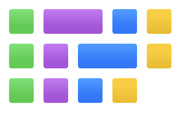
If you don’t need a third row, you can add one anyway, but with zero height. You may still need to deal with the spacing though. Fortunately, this is not a common occurrence, but I though I mention in case you run into this situation.
HoneyComb Revisited
In the article Impossible Grids, were we explored lazy grids, I wrote an example of how to use those grids to present the cells in a honeycomb. Creating such a grid is a good way to test the limits of what is possible with the grid, so I thought I would repeat the exercise, but this time using eager grids.
The full working grid is available in this gist file. If you need pictures to test the code, you can visit https://this-person-does-not-exist.com. You may download square pictures with random faces of people that do not exist! They are AI generated. Spooky, I know! 😲 The images used in the video are from that website.
Steps from Square to Hexagon
We have to start somewhere, so we will create a grid of square images and then gradually add code to transform our simple grid into a honeycomb.
By now, you should have all the knowledge necessary to achieve the transformation. I will provide you with a starting point and a series of steps you need to perform, in order to successfully achieve the transformation. However, if you don’t have the time, or if you get stuck, you can check the code in the gist file indicated above. The code has comments indicating where each steps it performed.
Note that the flipping of the cells is not really part of the exercise, but I included it in the gist too.
The following video shows the starting point and how it morphs into the honeycomb:
- Step #1: We start with a grid of square pictures.
- Step #2: Hexagons do not have a 1:1 size ratio. Its
heightequalswidth * cos(.pi/6). If you want to know why, check Impossible Grids, where I explain why. - Step #3: Clip the image with the provided hexagon shape.
- Step #4: Shift even and odd rows to opposite sides. The amount to offset is half of the hexagon width + grid horizontal spacing.
- Step #5: Rows need to overlap, so you need to reduce the row height to three quarters (3/4). Why 3/4?, again check Impossible Grids, where I explain why.
- Step #6: To remove empty spaces, clip the grid borders (or put it inside a ScrollView, which does the clipping for you).
- Step #7: If you make the vertical spacing equal to the horizontal spacing, the cells will space evenly.
Starting Point
In order to get you started, here’s some code. First, we need some data:
struct Person {
    let name: String
    let image: String
    var color: Color = .accentColor
    var flipped: Bool = false
}

class DataModel: ObservableObject {
    static let people: [Person] = [
        Person(name: "Peter", image: "image-1"),
        Person(name: "Carlos", image: "image-2"),
        Person(name: "Jennifer", image: "image-3"),
        Person(name: "Paul", image: "image-4"),
        Person(name: "Charlotte", image: "image-5"),
        Person(name: "Thomas", image: "image-6"),
        Person(name: "Sophia", image: "image-7"),
        Person(name: "Isabella", image: "image-8"),
        Person(name: "Ivan", image: "image-9"),
        Person(name: "Laura", image: "image-10"),
        Person(name: "Scott", image: "image-11"),
        Person(name: "Henry", image: "image-12"),
        Person(name: "Laura", image: "image-13"),
        Person(name: "Abigail", image: "image-14"),
        Person(name: "James", image: "image-15"),
        Person(name: "Amelia", image: "image-16"),
    ]

    static let colors: [Color] = [.yellow, .orange, .red, .purple, .blue, .pink, .green, .indigo]

    @Published var rows: [[Person]] = DataModel.buildDemoCells()

    var columns: Int { rows.first?.count ?? 0 }
    var colCount: CGFloat { CGFloat(columns) }
    var rowCount: CGFloat { CGFloat(rows.count) }

    static func buildDemoCells() -> [[Person]] {
        var array = [[Person]]()

        // Add 7 rows
        for r in 0..<7 {
            var a = [Person]()

            // Add 6 cells per row
            for c in 0..<6 {
                let idx = (r*6 + c)
                var person = people[idx % people.count]
                person.color = colors[idx % colors.count]
                a.append(person)
            }

            array.append(a)
        }

        return array
    }
}
You will also need an hexagon shape:
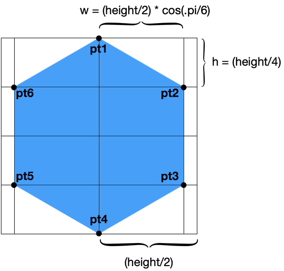
struct HexagonShape: Shape {
    func path(in rect: CGRect) -> Path {
        Path { path in

            let height = rect.height
            let width = rect.height * cos(.pi/6)

            let h = height / 4
            let w = width / 2

            let pt1 = CGPoint(x: rect.midX, y: rect.minY)
            let pt2 = CGPoint(x: rect.midX + w, y: h + rect.minY)
            let pt3 = CGPoint(x: rect.midX + w, y: h * 3 + rect.minY)
            let pt4 = CGPoint(x: rect.midX, y: rect.maxY)
            let pt5 = CGPoint(x: rect.midX - w, y: h * 3 + rect.minY)
            let pt6 = CGPoint(x: rect.midX - w, y: h + rect.minY)

            path.addLines([pt1, pt2, pt3, pt4, pt5, pt6])

            path.closeSubpath()
        }
    }
}
And finally, your starting grid:
struct ContentView: View {
    @StateObject private var model = DataModel()

    private let cellWidth: CGFloat = 100
    private let cellHeight: CGFloat = 100

    var body: some View {
        VStack {
            Grid(alignment: .center, horizontalSpacing: 2, verticalSpacing: 2) {
                ForEach(model.rows.indices, id: \.self) { rowIdx in
                    GridRow {
                        ForEach(model.rows[rowIdx].indices, id: \.self) { personIdx in

                            let person = model.rows[rowIdx][personIdx]

                            Image(person.image)
                                .resizable()
                                .frame(width: cellWidth, height: cellHeight)
                        }
                    }
                }
            }
        }
        .frame(maxWidth: .infinity, maxHeight: .infinity)
        .background(Color.white)
    }
}
Summary
The Grid view added this year is very simple to use, and adds to the existing layout container views we already had. This year, however, also introduced a new Layout protocol that provides even more options when it comes to placing our views on screen. We will explore that in a future article. In the meantime, I hope you enjoy this post and the Grid trainer app.
Please feel free to comment below, and follow me on twitter if you would like to be notified when new articles come out. Until next time!
I love the grid trainer app. Wow, I am so impressed.
Thanks! I enjoyed writing it 😉
Excellent. Helped me immensely get up to speed.
Thanks! This is so good. I especially enjoyed the Grid Trainer. A thought hit me: There seems to be a motion in SwiftUI towards composite objects like Grid and Charts, with ever more modifiers. Like for the AppStore, new stuff strives ever harder to be a part of the developers active repertoire. Grid Trainer – and trainers in general – show a new way: Composite objects fully presented, structured, even visualized and animatable, code presented or under the hood! This is the missing link for coding to really reach out, a leap in simplicity and intuitiveness. I’ll be exited to see whether things go the ‘trainer way’ up in Cupertino.