Alignment guides are a powerful, but usually underused layout tool. In many cases, they help us avoid more complex options, such as anchor preferences. As you can see in this example, changes to the alignment can be automatically (and easily) animated too.

Code: alignment-guides-animation.swift
If you ever tried using alignment guides though, chances are, you may have been puzzled by the results. They tend to do what you expect them to do, until they don’t. Since we are in the early stages of SwiftUI, you may think… bah! just another bug, disregard and move to something else.
After spending some time testing the limits of alignment guides, I arrived at the conclusion that they do work. However, there’s confusion about what we expect from them. This confusion comes from not realizing there’s a whole set of implicit alignment guides in effect. When we ignore them, things do not go our way. If you remember one thing from this article, it should be this: EVERY VIEW inside a container, has an alignment guide.
In this article, I will try to remove all the confusion around the topic, so we know exactly what to expect and how to get the results we want. The code included, will also serve as a learning app. It will let you see visually what happens during alignment.
By the end of this post, you should be confident about what can and cannot be done with alignment guides.
What Is an Alignment Guide
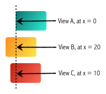
An alignment guide is basically a numeric value. It sets a point in a view, that determines how to position it in relation to the rest of its siblings. Note that alignments can be vertical or horizontal. To continue explaining the concept, let’s explore horizontal alignments first.
Suppose we have three views (A, B and C). Their horizontal guides are 0 (zero), 20 and 10 respectively. The views will be positioned, so that the beginning of view A (zero points from its beginning), is aligned with the 20th horizontal point of View B and the 10th horizontal point in C:
The same concept, applied to vertical alignment:
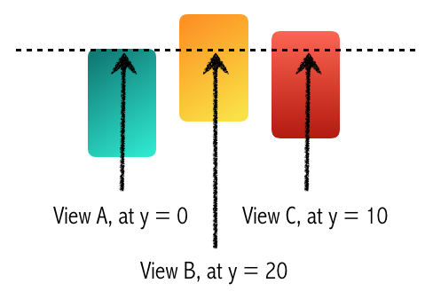
From these examples, there’s another fact you should commit to memory: Vertical containers (VStack), need horizontal alignments, while horizontal containers (HStack), require vertical alignments. It may seem odd at first, but if you look carefully at the pictures, you will realize it makes complete sense.
What About ZStack?
We will work with ZStack containers later, but you should know that a ZStack requires both a horizontal and a vertical alignment.
Where The Confusion Begins
I think the first thing to address is the fact that you can specify something like <strong>.leading</strong> in too many places. However, in each case, it has a completely different meaning:
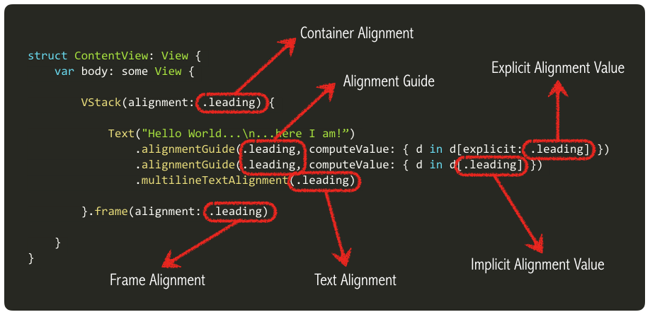
You should not be taken aback by this. We are going to dive deep into each of these parameters, and they will all make sense to you soon. I’ll provide a basic description here, but we’ll elaborate further, down below.
Container Alignment: It has two purposes. It dictates which alignmentGuides() are to be ignored and which ones aren’t. But it also defines implicit alignment guides for all its contained views that do not have an explicit guide.
Alignment Guide: Unless this value matches the Container Alignment parameter, this guide will be ignored during layout.
Implicit Alignment Value: It’s a numeric value, indicating the position of the guide for the view it modifies. There are some handy preset values such as d.width, d[.leading], d[.center], etc, but ultimately we are returning a numeric value. This is a default (implicit) value associated with a given guide.
Explicit Alignment Value: It’s a numeric value, indicating the position of the guide for the view it modifies. This is an explicit value (i.e., one that was defined programmatically by you).
Frame Alignment: Indicates how are all the contained views aligned (as a unique group), inside the container.
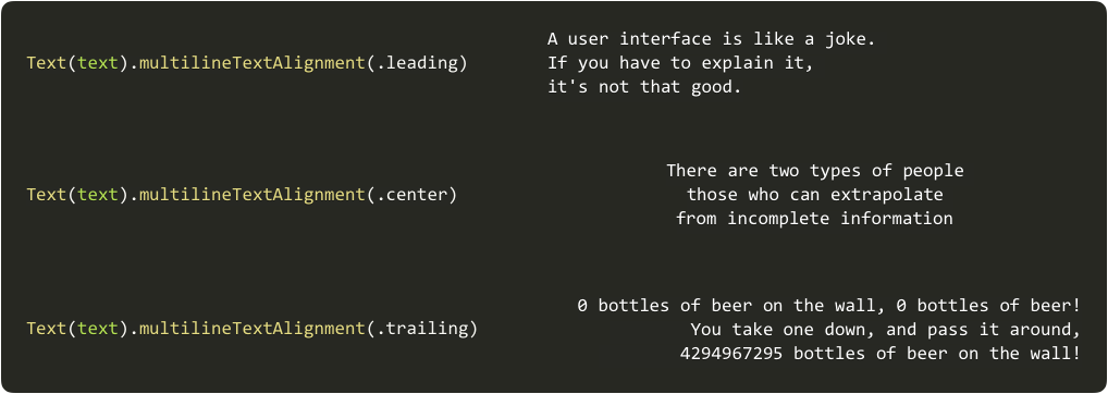
Text Alignment: For multiline text views, it specifies how the text lines are aligned inside the text view.
Implicit vs. Explicit Alignments
Every view in a container has an alignment. It’s highlighted, because it is one of the most important concepts to remember. When we define the alignment by calling .alignmentGuide(), the alignment is explicit. When we leave it unspecified, it is implicit. The value of the implicit alignment will be provided by the alignment parameter in the container view (e.g., VStack(alignment: .leading)). We will later see what these values are.
You may wonder, what happens if we do not specify an alignment parameter for VStack, HStack or ZStack? Well, they do have a default. And it is .center in all cases. Easy to remember.
ViewDimensions
We’ve seen so far that we specify alignment guides as a CGFloat in the computeValue closure of the .alignmentGuide() modifier. It is an arbitrary number we must return. It could be challenging to calculate such a number if we didn’t have some data to work with. Fortunately, we do. Let’s explore the .alignmentGuide() method declaration:
func alignmentGuide(_ g: HorizontalAlignment, computeValue: @escaping (ViewDimensions) -> CGFloat) -> some View
func alignmentGuide(_ g: VerticalAlignment, computeValue: @escaping (ViewDimensions) -> CGFloat) -> some View
It’s an overloaded method, with two versions, one for horizontal guides, and one for vertical guides. But what’s most interesting about this method, is that the computeValue closure provides us with a parameter of type ViewDimensions. This type is a struct, with some useful information about the view for which we are creating the alignment guide:
public struct ViewDimensions {
    public var width: CGFloat { get } // The view's width
    public var height: CGFloat { get } // The view's height

    public subscript(guide: HorizontalAlignment) -> CGFloat { get }
    public subscript(guide: VerticalAlignment) -> CGFloat { get }
    public subscript(explicit guide: HorizontalAlignment) -> CGFloat? { get }
    public subscript(explicit guide: VerticalAlignment) -> CGFloat? { get }
}
The easiest to figure out, are width and height. There’s little to say about them. They are what they seem: they hold the width and height of the view we are working with.
But then we have those puzzling subscript methods, which receive a HorizontalAlignment or <strong>VerticalAlignment</strong> value as their index. Let’s see how we can access them:
Text("Hello")
    .alignmentGuide(HorizontalAlignment.leading, computeValue: { d in
        return d[HorizontalAlignment.leading] + d.width / 3.0 - d[explicit: VerticalAlignment.top]
    })
We will see what these values are in a minute when we explore the <strong>HorizontalAlignment</strong>, VerticalAlignment and Alignment types.
Ambiguous Use of Alignment
Most of the time, we do not need to specify the full name of the alignment like this:
d[HorizontalAlignment.leading] + d.width / 3.0 - d[explicit: VerticalAlignment.top]The compiler can infer if we are talking about HorizontalAlignment or VerticalAlignment, so we could simply use:
d[.leading] + d.width / 3.0 - d[explicit: .top]However, in some cases, the compiler may complain about the ambiguous use of alignment, especially when using the .center value. That is because there are two types of .center values: HorizontalAlignment.center and VerticalAlignment.center. When the compiler cannot infer which type you are using, you may need to specify the full name. As in some of the examples we’ll see.
HorizontalAlignment Type
When a ViewDimension value is accessed with an index of type HorizontalAlignment, we can obtain the leading edge of a view, the center of the view or the trailing edge of the view:
extension HorizontalAlignment {
    public static let leading: HorizontalAlignment
    public static let center: HorizontalAlignment
    public static let trailing: HorizontalAlignment
}
Note that the index can be specified in two ways:
d[.trailing]
d[explicit: .trailing]
The first one is the implicit value. That means, the default value for a given alignment type. It would normally be zero for .leading, width/2.0 for .center and width for .trailing.
However, you can also obtain the explicit value of a given alignment guide. For example, in a ZStack, it may make sense for you to reference the .top explicit value when computing the explicit .leading value. Should you ever want this, although unfrequent, you may do so. Note that it will return an Optional CGFloat. That’s because not all views have explicit alignment guides.
VerticalAlignment Type
The VerticalAlignment works just like HorizontalAlignment, but it has a few more points of interest. Besides .top, .center and .bottom. You may also get firstTextBaseline (the topmost text baseline) and lastTextBaseline (the bottom-most text baseline).
extension VerticalAlignment {
    public static let top: VerticalAlignment
    public static let center: VerticalAlignment
    public static let bottom: VerticalAlignment
    public static let firstTextBaseline: VerticalAlignment
    public static let lastTextBaseline: VerticalAlignment
}
Alignment Type
As mentioned before, ZStack containers need a way of specifying two alignments (one horizontal and one vertical). For that, we have the Alignment type, which combines these two. For example, if we want to have a top vertical alignment with a leading horizontal alignment, we have two options:
ZStack(alignment: Alignment(horizontal: .leading, vertical: .top)) { ... }Or the most common:
ZStack(alignment: .topLeading) { ... }The first option will make sense when we start working with custom alignment guides, later on.
Container Alignment
The alignment parameter in the container view (VStack, HStack or ZStack), has two effects:
- Determine which .alignmentGuides() are relevant for layout. All the alignment guides that have a different alignment than the one in the container parameter, will be ignored during layout.
- It provides the implicit alignment guide for those views that do not have an explicit alignment set.
In the following animation, you can see how changing the alignment parameter in the container, will change the alignment guides in effect during layout.
Note that if you change the alignment inside a withAnimation block, the views will move to their new position.
Code: alignment-guides-implicit.swift
Frame Alignment
All the alignments we’ve seen so far, deal with how to position views relative to one another. Once that is determined, the layout system needs to position the whole group inside the container. By providing frame(alignment:), you are telling the system how to do so. If left unspecified, the group will be centered inside its container.
More often than not, changing the frame alignment will have no effect. This is not a bug. In most cases, the container is tight. That is, the container is large enough to hold all its views, but not a pixel more. For that reason, using .leading, .center or .trailing in the frame() modifier will have no effect, as the view group is already using all the space. It cannot be moved to either side, as there’s no space left. We’ll appreciate it visually, later on, when we start using the learning app.
Multiline Text Alignment()
This one is easy and very straight forward. When we have a Text view with more than one line, it will determine how lines align among themselves.
Interacting with the Alignment Guides
For this article, I created a useful learning tool. It will let us explore what we learned so far. I recommend you run the code on an iPad in landscape mode. If you don’t have an iPad, simply use the simulator.
Code: alignment-guides-tool.swift
Use the “Show in Two Phases” option, to understand how alignments work. You will see how the alignment guide moves to its new place, and then how the views are moved to make all guides to actually be aligned. Note that normally, all this happens simultaneously. However, this option breaks it down in two, for a better understanding of the process.
These are some of the things to try:
- Try the frame(alignment:) parameter. See how it works both with a tight vs a wide container. You should notice this parameter will have no effect when our container is tight.
- Change the container alignment and note that the change will have no effect, as long as the alignment guides are of the same type. The only view that will move, is the one with an implicit alignment. This is because it is the only view with a different alignment value.
- Test different preset alignment values, by interacting with the views. You may set alignment guides to .leading (press the L button), .center (press the C button), .trailing (press the T button).
- Test different arbitrary alignment values, by interacting with the views. Tap on the yellow bar, to pick the point of alignment.
- Test alignment values that are either less than zero or greater than the view’s width. To do so, extend the yellow bar.
When you test different values, try to predict what will happen before you tap the screen. Do you always get it right? If you do, you are ready to start creating some custom alignments. Read on…
Custom Alignments
Now that we know how standard alignments work, we are going to create a custom alignment. Let’s see the code of our first example, and analyze what it does:
extension HorizontalAlignment {
    private enum WeirdAlignment: AlignmentID {
        static func defaultValue(in d: ViewDimensions) -> CGFloat {
            return d.height
        }
    }

    static let weirdAlignment = HorizontalAlignment(WeirdAlignment.self)
}
When we define a custom alignment, we are doing two things:
- Determine if it will be horizontal or vertical.
- provide a default value for implicit alignments (i.e., views that do not have an explicit call to .alignmentGuide())
We’ll have a little fun, by using the height as the default alignment. It creates a funny looking effect:
struct CustomView: View {
    var body: some View {
        VStack(alignment: .weirdAlignment, spacing: 10) {

            Rectangle()
                .fill(Color.primary)
                .frame(width: 1)
                .alignmentGuide(.weirdAlignment, computeValue: { d in d[.leading] })

            ColorLabel(label: "Monday", color: .red, height: 50)
            ColorLabel(label: "Tuesday", color: .orange, height: 70)
            ColorLabel(label: "Wednesday", color: .yellow, height: 90)
            ColorLabel(label: "Thursday", color: .green, height: 40)
            ColorLabel(label: "Friday", color: .blue, height: 70)
            ColorLabel(label: "Saturday", color: .purple, height: 40)
            ColorLabel(label: "Sunday", color: .pink, height: 40)

            Rectangle()
                .fill(Color.primary)
                .frame(width: 1)
                .alignmentGuide(.weirdAlignment, computeValue: { d in d[.leading] })
        }
    }
}

struct ColorLabel: View {
    let label: String
    let color: Color
    let height: CGFloat

    var body: some View {
        Text(label).font(.title).foregroundColor(.primary).frame(height: height).padding(.horizontal, 20)
            .background(RoundedRectangle(cornerRadius: 8).fill(color))
    }
}
Aligning Non-Siblings
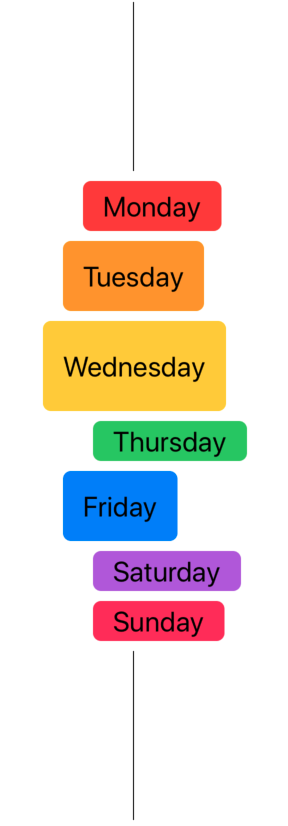
In the previous example, we’ve seen how a custom alignment can be created. But what’s the point? The same result can be accomplished without a custom alignment. The real benefits of using custom alignments, is using them to align views that reside on different branches of the view hierarchy.
Let’s have a look at our next example:
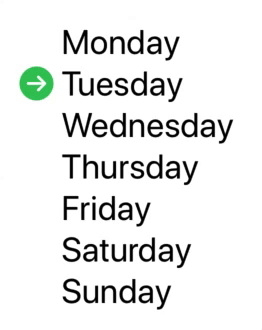
If we analyze the components of this view, we’ll realize that we need to align an image, with a text view. But they do not belong to the same container:
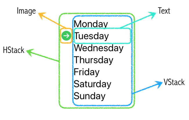
Both our image and our text view have a common container (the HStack), so we will create a custom alignment in order to match their center points. It’s important to remember to set the alignment parameter of the common container appropriately.
extension VerticalAlignment {
    private enum MyAlignment : AlignmentID {
        static func defaultValue(in d: ViewDimensions) -> CGFloat {
            return d[.bottom]
        }
    }
    static let myAlignment = VerticalAlignment(MyAlignment.self)
}

struct CustomView: View {
    @State private var selectedIdx = 1

    let days = ["Monday", "Tuesday", "Wednesday", "Thursday", "Friday", "Saturday", "Sunday"]

    var body: some View {
            HStack(alignment: .myAlignment) {
                Image(systemName: "arrow.right.circle.fill")
                    .alignmentGuide(.myAlignment, computeValue: { d in d[VerticalAlignment.center] })
                    .foregroundColor(.green)

                VStack(alignment: .leading) {
                    ForEach(days.indices, id: \.self) { idx in
                        Group {
                            if idx == self.selectedIdx {
                                Text(self.days[idx])
                                    .transition(AnyTransition.identity)
                                    .alignmentGuide(.myAlignment, computeValue: { d in d[VerticalAlignment.center] })
                            } else {
                                Text(self.days[idx])
                                    .transition(AnyTransition.identity)
                                    .onTapGesture {
                                        withAnimation {
                                            self.selectedIdx = idx
                                        }
                                }
                            }
                        }
                    }
                }
            }
            .padding(20)
            .font(.largeTitle)
    }
}
You may wonder, but what about all the text views that do not specify an explicit vertical alignment? Aren’t they going to use the implicit value? And if so, won’t they all be place one on top of the other?
All valid questions. This is another fact of alignment guides that may be puzzling. However, in this case, we are dealing with a VStack, not a ZStack. That means all views inside it must be stacked vertically. Alignment guides will not break that. The layout system will use the explicit alignment in the selected view to align the arrow image. The other text views that do not have an explicit guide will be positioned relative to the one that does.
ZStack Custom Alignment
If you ever need to create a custom alignment for a ZStack, here you have a template:
extension VerticalAlignment {
    private enum MyVerticalAlignment : AlignmentID {
        static func defaultValue(in d: ViewDimensions) -> CGFloat {
            return d[.bottom]
        }
    }

    static let myVerticalAlignment = VerticalAlignment(MyVerticalAlignment.self)
}

extension HorizontalAlignment {
    private enum MyHorizontalAlignment : AlignmentID {
        static func defaultValue(in d: ViewDimensions) -> CGFloat {
            return d[.leading]
        }
    }

    static let myHorizontalAlignment = HorizontalAlignment(MyHorizontalAlignment.self)
}

extension Alignment {
    static let myAlignment = Alignment(horizontal: .myHorizontalAlignment, vertical: .myVerticalAlignment)
}

struct CustomView: View {
    var body: some View {
        ZStack(alignment: .myAlignment) {
            ...
        }
    }
}
In Summary
In this post, we’ve seen how powerful alignment guides can be. Once you understand what they can provide, they will start to make more sense. For a painless experience, you should always remember the following:
- Every view in a container has an alignment guide. If not specified explicitly, it will be determined by the alignment parameter of the container.
- During layout, alignment guides with a type different than the one specified in the container alignment parameter will be ignored.
- VStacks use HorizontalAlignment, while HStacks use VerticalAlignment.
- If the container is tight, the alignment parameter in the frame method will have no visual effect.
- Custom alignment guides are needed when two views from different branches of the view hierarchy need to be aligned with each other.
Most of the examples in this article use horizontal alignments, but the same concepts apply to vertical alignments.
I hope you found this article useful and no longer feel frustrated when trying to figure out why an alignment guide is not doing what you want it to do. Please feel free to comment, and follow me on twitter if you want to be notified when new articles are posted. Until next time.
Thanks for swiftui-lab.com
谢谢,您的文章对我帮助很大。
Thank you very much for your articles. I read them with great pleasure, you are opening new horizons for me.
I found an interesting case for your Aligning Non-Siblings sample:
Text(self.days[idx]) .transition(AnyTransition.scale(scale: 2)) .onTapGesture { withAnimation { self.selectedIdx = idx } }You’re doing some amazing work there!
Thank you for your time for making this amazing tutorial!
Javi, this is incredible! Congratulations and thank you for sharing
Thanks!
Thanks for swiftui-lab.com For a deeper understanding
In CustomView , why does the HStack need .myAlignment? Why does defaultValue return d[VerticalAlignment.bottom] ? I tried other values and nothing changes.
The
.myAlignmentis needed on HStack, otherwise the.alignmentGuide(.myAlignment, ...)calls are ignored.The AlignmentID protocol requires you to define a defaultValue method. It is the implicit alignment value that will be used, if none is specified through .alginmentGuide(). In the example, the alignment guide is explicity set, so changing gthe defaultValue won’t have an effect.
You are a rock star Javier! Single best explanation of this topic I’ve ever seen, thank you SO much!
Thanks! Glad it helped.
It’s just amazing you figured all this out and apply to all the example use cases. I just don’t understand how the penultimate example works (the Monday, Tuesday, Wednesday… one). I added spacing: to the VStack { ForEach …} container and it still align correctly! It’s my own fault not understanding how the custom VerticalAlignment guide is making them align to each other. Will have to re-read this a few more times.
Thanks for your great work!
This is a really cool article, most of it finally clicked the third time I read it. One thing I found which was strange was that ZStack ignores the implicit alignment unless you have a resizable Image or a Color. Uncomment the Color(.yellow) line out to see it default to .center
I tried with HStack, VStack, and only got it to work when I added the Color or a resizable image. Putting this here to save someone else wastes a couple of hours trying to get ZStack alignment working. Very Strange!
Hi Brett, in your code, ZStack is not ignoring the .topLeading. In fact, it is still doing what it should. Let’s explore a little bit more.
Color views like to expand and occupy as much space as possible, on the other side, Text views like to use just what they need to draw the text.
Also note that the alignment parameter in the ZStack, determines how views inside the ZStack align with each other, not how they align with the ZStack bounds. By removing the Color view, text has nothing to align with. But…
There is also an alignment parameter in the .frame() modifier. This one determines how the contents (as a whole) align with the bounds of the containing view.
In your example, if the Color view is present, the ZStack will expand to give as much space as its content require. Because the Text view aligns with the big yellow Color view, it all seems to do what you want.
If you remove the Color view, the ZStack will only expand to the size of the Text view. Because the Text view has the same size as the ZStack, any alignment will not be noticed, as all alignments produce the same result. And because the ZStack is centered on the screen, it seems the text is centered, although it is the ZStack the one being centered.
The best way to understand this, is adding the following to your code.
Experiment with different combinations and you’ll understand. Alternatively, run the code from the article, which will let you play with different alignment parameters.
Cheers,
Javier.-
Super useful article, thanks a lot!
I was struggling how to do pixel perfect UI with SwiftUI. My company dose not sacrifice a single pixel in the UI design, I was wondering how to position elements in desired point, like (100,100) off the screen. I think this article will help me establish that. I was really struggling with alignment, thank you “The SwiftUI Lab”.
Happy to help
Amazing article!

One question though. Why do we need “.transition(AnyTransition.identity)” on Texts? Code seems to work exactly the same with or without it
Thanks!
Hi Sergej,
I wrote the article a long time ago, and I don’t remember exactly. But transitions have always been a little buggy, so it was probably removing some undesired implicit transition. It’s in my TODO list to review all my posts for outdated information (especially after WWDC2020).
Great! Thank you, Javier!
This blog is nothing short of exceptional, this is really shedding some light on the darker, under-documented parts of swiftUI. Thank you so much for this incredibly useful resource.
How can we donate?!
Hi Sacha, thank you! No donations are necessary, but thanks a lot for asking!
I guess you leave me with no choice but to buy the companion app
Keep up the amazing work !
Totally agree! I find SwiftUI-Lab featuring the most useful and in-depth articles! I adore the example videos and overall style – it is encouraging and playful!

Going to buy companion app!
P.S. I still can’t wrap my mind around the custom alignment guides
still trying to digest this… lots of knowledge… somehow I thought this would be … simpler, easier, more basic…
Thanks!
Amazing article!
 . While doing one work around I struck at this point. Plz help me through.
above piece of code is working fine & getting multiple lines bt the trailing of the text “Both our image…..” is going out of bounds as we have 90px leading shift provided to “Porthos” text. In this case how to make all the text to display?
i have problem to understand Explicit and implicit alignment, what ist the differences?
Every view in SwiftUI has an alignment guide. If the alignment guide was provided by the user, using the .alignmentGuide() modifier, then we say it is an explicit alignment guide. However, if there is no .alignmentGuide() called on the view, the view still does have an “unspecified” alignment guide. A default if you will. This default alignment guide is what we call the implicit alignment guide.
Thanks.
Awesome Article … and amazing demonstration code and tutorials ! What great patience you have for helping understanding !
Thanks. I also learn a lot while writing these articles!
It’s been a while since I read this article the first time… and the second time… Honestly, I don’t know how many times I did read it. Well, I finally tried around with it a little, especially with those ZStack alignments.
What I had struggle to understand is the outer Container Alignment guide. If I get this, it’s like a namespace? But it’s more, isn’t it?
I tried that with custom alignments and it all works fine, if I put the Container alignment to Alignment.center, and the corresponding inner alignments to VerticalAlignment.center, HorizontalAlignment.center, everything looks weird.
I threw together an example: https://github.com/GoldenStat/AlignmentGuides
It creates a grid with something like playing cards and a marker that moves around, depending on the Card you activate. But all alignment relations are hard-coded.
It boils down to:
(I created an alignmentObject struct to connect the box’s and the marker’s alignment – the markers alignment is analogous and the alignment(for:) – function has the alignment pairs hardcoded)
In this case, the effect I want to achieve is probably better covered by geometry Effect.
Great article, thank you – I hope I will be able to give back, one day
Wonderful demo!!
Very helpful, thx very much