
In this article, we are going to discuss a simple but useful SwiftUI feature. You probably already experimented with it, and think it is just a trivial exercise… but don’t fly away so soon. I’ll present the basic setup of a button and a toggle style, but then, we’ll see some aspects that are usually forgotten: how to play nice when inside a Form, and the importance of the accessibility activation point. Finally, and probably the most fun, we’ll learn how to implement the same styling pattern with our own custom controls… not just toggles and buttons.
Hopefully, I got your attention, so let’s get on with it.
What is a Style in SwiftUI?
Views and especially controls, usually have a look and a logic. Styles let us alter the appearance of the view, but keep their logic intact. For example, the logic of a button can be described as an interactive view (usually through a tap or a click). When the interaction is complete, a callback function is executed. That is more or less always the same. Its style, on the other hand, can vary: a typical example is a text view that shows the label contents and dims while pressed. However, we could change that and replace the dim, with a scale down effect. Whatever we do, the logic is still the same.
How Does a Style Work?
ButtonStyle, ToggleStyle and all the other styles, are simply protocols. They have a method that creates the view. For example:
func makeBody(configuration: Self.Configuration) -> some ViewThe method receives some properties required to implement the logic of the control. These properties are commonly referred to as the configuration of the style. In ButtonStyle, for example:
public struct ButtonStyleConfiguration {
    public let label: ButtonStyleConfiguration.Label
    public let isPressed: Bool
}
Predefined vs Custom Styles
Several SwiftUI views can be styled and styles are platform dependent. Some may be available on macOS but not on iOS, and vice-versa. Buttons, Toggles, Pickers and TextFields are some of the views that can be styled, through their related modifiers: .buttonStyle(), .toggleStyle(), .pickerStyle(), .textFieldStyle(), etc.
SwiftUI offers some predefined styles for each of these views, but you can also create your own. Unfortunately, not all styles are customizable. For example, on iOS, it is perfectly ok to create a custom style for a button or a toggle, but styling a picker, to the best of my knowledge, is not possible. If you need to style a picker, you’ll just have to create your own picker view.
Why a picker cannot be styled you say? I’m glad you asked. Remember the makeBody function and Configuration type we describe before? In the case of PickerStyle, these are defined internally. If you look at the public protocol definition. Here’s what you’ll find:
public protocol PickerStyle { }I can, of course, be mistaken… and I would love for someone to prove me wrong. Please do write to me if you are able to customize a picker.
Button Custom Styles
Buttons have two style protocols: ButtonStyle and PrimitiveButtonStyle. The latter gives you more control.
ButtonStyle
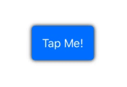
To implement ButtonStyle, you simply need to display the label of the button and make its appearance different while it is pressed. You do not need to worry about the tap gesture. In this example, we are going to dim and scale down the view:
struct MyButtonStyleExample: View {
    var body: some View {
        VStack {
            Button("Tap Me!") {
                print("button pressed!")
            }.buttonStyle(MyButtonStyle(color: .blue))
        }
    }
}

struct MyButtonStyle: ButtonStyle {
    var color: Color = .green

    public func makeBody(configuration: MyButtonStyle.Configuration) -> some View {

        configuration.label
            .foregroundColor(.white)
            .padding(15)
            .background(RoundedRectangle(cornerRadius: 5).fill(color))
            .compositingGroup()
            .shadow(color: .black, radius: 3)
            .opacity(configuration.isPressed ? 0.5 : 1.0)
            .scaleEffect(configuration.isPressed ? 0.8 : 1.0)
    }
}
PrimitiveButtonStyle
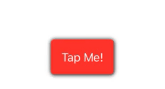
The PrimitiveButtonStyle style offers more control. With this style, we can decide when to trigger the action, if at all. In the example below, we use a long press gesture and only trigger when 1 second has elapsed. If the user stops pressing before the time, the action is not executed.
struct ContentView: View {
    @State private var text = ""

    var body: some View {
        VStack(spacing: 20) {
            Text(text)

            Button("Tap Me!") {
                self.text = "Action Executed!"
            }.buttonStyle(MyPrimitiveButtonStyle(color: .red))
        }
    }
}

struct MyPrimitiveButtonStyle: PrimitiveButtonStyle {
    var color: Color

    func makeBody(configuration: PrimitiveButtonStyle.Configuration) -> some View {
        MyButton(configuration: configuration, color: color)
    }

    struct MyButton: View {
        @GestureState private var pressed = false

        let configuration: PrimitiveButtonStyle.Configuration
        let color: Color

        var body: some View {
            let longPress = LongPressGesture(minimumDuration: 1.0, maximumDistance: 0.0)
                .updating($pressed) { value, state, _ in state = value }
                .onEnded { _ in
                   self.configuration.trigger()
                 }

            return configuration.label
                .foregroundColor(.white)
                .padding(15)
                .background(RoundedRectangle(cornerRadius: 5).fill(color))
                .compositingGroup()
                .shadow(color: .black, radius: 3)
                .opacity(pressed ? 0.5 : 1.0)
                .scaleEffect(pressed ? 0.8 : 1.0)
                .gesture(longPress)
        }
    }
}
Custom Toggle Style
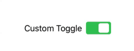
To customize a toggle control, we follow the same pattern as with buttons, using the ToggleStyle protocol. Although in this case, the ToggleStyleConfiguration type provides us with different properties. For toggles, we get the label, a boolean indicating the current state of the toggle and a binding to update the state.
I’ll be keeping the design of the switch very simple because I want to focus on some other important considerations. Having a complex graphic design may distract us from those other aspects of the customization. I am intentionally calling the .toggleStyle() on the VStack, to help you realize that the method has a cascading effect on all the subviews in the view hierarchy.
Out custom toggle will look like this:
struct ContentView: View {
    @State private var flag = true

    var body: some View {
        VStack {
            Toggle(isOn: $flag) {
                Text("Custom Toggle")
            }
        }
        .toggleStyle(MyToggleStyle())
    }
}

struct MyToggleStyle: ToggleStyle {
    let width: CGFloat = 50

    func makeBody(configuration: Self.Configuration) -> some View {
        HStack {
            configuration.label

            ZStack(alignment: configuration.isOn ? .trailing : .leading) {
                RoundedRectangle(cornerRadius: 4)
                    .frame(width: width, height: width / 2)
                    .foregroundColor(configuration.isOn ? .green : .red)

                RoundedRectangle(cornerRadius: 4)
                    .frame(width: (width / 2) - 4, height: width / 2 - 6)
                    .padding(4)
                    .foregroundColor(.white)
                    .onTapGesture {
                        withAnimation {
                            configuration.$isOn.wrappedValue.toggle()
                        }
                }
            }
        }
    }
}
Special Consideration #1: Accessibility Activation Point
When you use native controls, accessibility comes built-in. However, when you start styling your own controls, you should be careful with activation points. The accessibility activation point, is the point in your view that VoiceOver will activate when the user double-taps the element. By default, it is in the center, but you may need to change it.
In our example, the switch only toggles when pressed on the white area of the design. If the activation is not properly set up, VoiceOver will not be able to toggle the switch. To make it work, we need to add the following to the HStack of the MyToggleStyle view:
.accessibility(activationPoint: configuration.isOn ? UnitPoint(x: 0.25, y: 0.5) : UnitPoint(x: 0.75, y: 0.5))The activation point can be expressed with a UnitPoints or a CGPoint. In our example, we move the activation from left to right, according to the switch state.
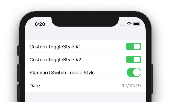
Special Consideration #2: Form (iOS)
When we put our toggle inside a Form, alongside other controls, things don’t go so well:
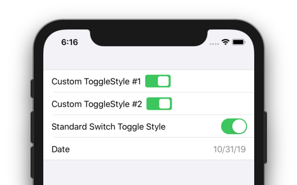
struct ContentView: View {
    @State private var flag1 = true
    @State private var flag2 = true
    @State private var flag3 = true

    @State private var date = Date()

    var body: some View {

        Form {

            Toggle(isOn: $flag1) {
                Text("Custom ToggleStyle #1")
            }

            Toggle(isOn: $flag2) {
                Text("Custom ToggleStyle #2")
            }

            Toggle(isOn: $flag3) {
                Text("Standard Switch Toggle Style")
            }
            .toggleStyle(SwitchToggleStyle())

            DatePicker(selection: self.$date,
                       displayedComponents: .date,
                       label: { Text("Date") })

        }
        .toggleStyle(MyToggleStyle())
    }
}
To fix that, we simply need to add a Spacer(), between the label and the switch:
Special Consideration #3: Form (macOS)
The same problem we had with iOS, is repeated in macOS, although it needs a different solution:
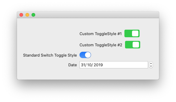
To solve the problem with the macOS Form, we use the leading alignment. The guide should be placed in the horizontal position between the label and the switch. In our example, since the label has a variable size, but the switch does not, we simply use the full width of the view minus the width of the switch:
.alignmentGuide(.leading, computeValue: { d in (d.width - self.width) })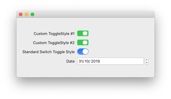
If you don’t know how alignment guides work in SwiftUI, check my other article: Alignment Guides in SwiftUI
Putting It All Together
Here’s the full implementation of the style. It plays nice with both macOS and iOS:
struct MyToggleStyle2: ToggleStyle {
    #if os(iOS)
    let width: CGFloat = 50
    #else
    let width: CGFloat = 38
    #endif

    func makeBody(configuration: Self.Configuration) -> some View {
        HStack {
            configuration.label

            #if os(iOS)
            Spacer()
            #endif

            ZStack(alignment: configuration.isOn ? .trailing : .leading) {
                RoundedRectangle(cornerRadius: 4)
                    .frame(width: width, height: width / 2)
                    .foregroundColor(configuration.isOn ? .green : .red)

                RoundedRectangle(cornerRadius: 4)
                    .frame(width: (width / 2) - 4, height: width / 2 - 6)
                    .padding(4)
                    .foregroundColor(.white)
                    .onTapGesture {
                        withAnimation {
                            configuration.$isOn.wrappedValue.toggle()
                        }
                }
            }
        }
        .accessibility(activationPoint: configuration.isOn ? UnitPoint(x: 0.25, y: 0.5) : UnitPoint(x: 0.75, y: 0.5))
        .alignmentGuide(.leading, computeValue: { d in (d.width - self.width) })

    }
}
Styled Custom Views
Now that we know how we can style some of the native views from SwiftUI, let’s explore how we can follow the same styling pattern, on our own custom views.
For this example, we are going to create a three-state toggle switch. As you can see, I have created two different styles: one that I call DefaultTripleToggleStyle and the other, named KnobTripleToggleStyle:
By implementing styling, we get to use our custom view, with this simple code:
struct ContentView: View {
    @State private var st: TripleState = .med

    var body: some View {
       HStack(spacing: 30) {
            TripleToggle(label: Text("Knob #1"), tripleState: $st)

            TripleToggle(label: Text("Knob #2"), tripleState: $st)

            TripleToggle(label: Text("Default"), tripleState: $st)
                .tripleToggleStyle(DefaultTripleToggleStyle())

            TripleToggle(label: Text("Knob #3"), tripleState: $st)
                .tripleToggleStyle(KnobTripleToggleStyle(dotColor: .black))

        }
        .tripleToggleStyle(KnobTripleToggleStyle(dotColor: .red))
    }
}
The code above shows you some interesting accomplishments:
- We have separated the styling, from the logic.
- We can set the styling in a view higher in the hierarchy, and it will affect its descendants.
- Setting the style on a specific subtree overrides the style set higher in the hierarchy.
- We created an extension on View (.tripleToggleStyle()), for easy setup.
- The KnobTripleToggleStyle is in itself customizable (i.e., the dot color)
I am making the complete code available on the gist file referenced below. But I encourage you to try to implement it yourself, without looking at the code. You will probably learn a lot in the process, even if you don’t succeed (especially if you don’t succeed).
You probably already see the challenges ahead. But I’ll provide some pointers to get you started:
Cascading Styles
One of the challenges is how we can set the styling high in our view hierarchy, and affect all the toggles below.
We already have some cascading features available in the framework. You probably guessed it: the environment. There are two ways to approach this: using an EnvironmentObject, or using a custom EnvironmentValue by implementing the EnvironmentKey protocol. In my implementation, I used the latter. It is much less explored and I thought it would be fun.
Dealing with Protocols That Use Self or Associated Types
If you haven’t hit this wall so far, you will definitely hit it now. I won’t spoil the compiler’s surprise, but you’ll know it when you see it. When you do, the answer has two words: type erasure. If you don’t know what that is, google: “swift type erasure” and you will get a pretty nice picture. There are many ways of accomplishing it, you’ll see one, in the gist below.
Gist File: TripleToggleStyle.swift
Summary
In this post, we have explored how we can use styling both in native views and our own custom views. This is a great tool for code reusability and readability. There are other techniques here: View Extensions for Better Code Readability.
Please feel free to comment or follow me on Twitter, if you want to be notified when new articles are released. Until next time!
Thanks Javier, Great article.
I would add two points.
The first point is there are two version of macOS projects: iOS project for macOS called Catalyst and macOS project using AppKit. Your MyToggleStyle2 is working on Catalyst only.
The second point you can use Group instead of AnyView when you need to return different types.
Hi filimo, that’s how it is supposed to look (I think). I’m basing my assumption in how the standard switch (the blue one) aligns with the rest. Forms in native macOS right align their labels, and put the respective controls immediately after the label. But forms in macOS catalyst, follow the iOS styling, which is labels go fully to the left and controls fully to the right.
If I’m not mistaken, this is how it is intended to work. But who knows…
Another amazing article and arguably one of the most useful ones. Thank you for this, you don’t stop to amaze me
Thank you for posting useful information that’s not really documented elsewhere. (Instead of just regurjitating what everyone else is saying, like the majority of blogs talking about SwiftUI).
Your blog helped me answer a question I’ve been having and no one on Stackoverflow knew how to answer it. I referenced your blog in the answer: https://stackoverflow.com/a/59210692
Thanks! I’m glad you got the spirit of the blog
“SwiftUI offers some predefined styles for each of these views, but you can also create your own. Unfortunately, not all styles are customizable. For example, on iOS, it is perfectly ok to create a custom style for a button or a toggle, but styling a picker, to the best of my knowledge, is not possible. If you need to style a picker, you’ll just have to create your own picker view. Why a picker cannot be styled you say? I’m glad you asked. Remember the makeBody function and Configuration type we describe before? In the case of PickerStyle, these are defined internally.”
Am I right in assuming this is the same for SliderStyle? Confusingly the documentation for Slider says:
“The appearance and interaction of Slider is determined at runtime and can be customized. Slider uses the SliderStyle provided by its environment to define its appearance and interaction. Each platform provides a default style that reflects the platform style, but providing a new style will redefine all Slider instances within that environment.”
However trying to conform to SliderStyle as you did with ToggleStyle leads to an error saying Use of undeclared type ‘SliderStyle’.
Does it seem like the documentation has been updated prematurely?
I did find PickerStyle in the documentation, so maybe it works now…
https://developer.apple.com/documentation/swiftui/pickerstyle
There is no such thing as
SliderStyle. I have seen other references to non-existing types, so I am not surprised. For the time being, afaik, there is no way of customizing the Slider. The only customization is the one that SwiftUI does according to the running platform.Is there anyway to do custom Text style, as in applying all those modifiers that return Text like bold(), italic(), underline(), foregroundColor() etc? Like ViewModifier, but apply to Text() and the result as Text, not some View?
You cannot do it with ViewModifier, but you can create a Text extension:
I was hoping for something like ViewModifier, but for Text only:
Great article! Based on the docs and the use of “compositingGroup” modifier in your article I guess it is used for improving the performance, but how does it actually work?
Normally, effects like shadow(), apply to each view. By using .compositingGroup(), you are applying the effect to the composed view as whole. In the specific case of this example, if you remove the .compositingGroup() call, a shadow will be drawn both for the blue rectangle, and another around the Text. Using the .compositingGroup() however, makes the shadow apply to the whole thing, so only a shadow around the blue rectangle will be drawn.
Btw, the method that is used for improving performance is drawingGroup() which is something completely different.
This was a really helpful article, thank you!
But I am really struggling with TextFieldStyles… it seems that it doesn’t work the `makeBody` method.. the compiler always complains thet “Type ‘BorderedTextField’ does not conform to protocol ‘TextFieldStyle'”… how to implement a custom TextFieldStyle?
Thanks a lot in advance.
As far as I know, it is not possible. As I mention in the article, not all styles can be customized. For some reason, Apple decided to hide the makeBody function from some styles, and in this case, it was kept private. If you check the definition file, you’ll see TextFieldStyle is defined as:
public protocol TextFieldStyle { }. So there isn’t much we can do. If you need something that you cannot achieve with the existing TextField view, your best alternative is to create you own TextField view, using UIViewRepresentable.There’s a nice blog post about TextFieldStlyle:
https://swiftwithmajid.com/2020/02/26/textfield-in-swiftui/
How on God’s wide earth is one to guess at what you explain in the gist file? I’m not speaking from the perspective of a total novice to SwiftUI, but what you did there was in no way prepared for in the preceding examples. Don’t get me wrong, I’m extremely (!) grateful for what you’ve accomplished and reveal on your blog, but despite spending 7-8 hours of trying to get the challenge to run, I didn’t even get close due to the lack of references to stuff like EnvironmentKeys and Configurations. Instead of a learning experience, this has been EXTREMELY frustrating to me.
Oops! I should have written an Environment post already… sorry!
I don’t know if this counts as “customizing a Picker in SwiftUI”, but you can cheat a bit by putting an .onAppear afterwards with classic styling in them. Here’s an example:
.pickerStyle(SegmentedPickerStyle()) .onAppear() { UISegmentedControl.appearance().selectedSegmentTintColor = .blue UISegmentedControl.appearance().setTitleTextAttributes([.foregroundColor: UIColor.white], for: .selected) UISegmentedControl.appearance().setTitleTextAttributes([.foregroundColor: UIColor.blue], for: .normal) }Great Article!!!
just a little adjust ,due to DRY,you can put func switchState() in Configuration definition:
func switchState(){
switch tripleState {
case .low:
tripleState = .med
case .med:
tripleState = .high
case .high:
tripleState = .low
}
}
and add configuration property in KnobTripleToggle struct:
public struct KnobTripleToggle: View {
let configuration: TripleToggleStyle.Configuration
}
at last you can call self.configuration.switchState() in
.onTapGesture {
withAnimation {
self.configuration.switchState()
}
}
you can do the same in DefaultTripleToggle struct