
Native support for grids in SwiftUI is finally here. This is made possible by two new views. These are LazyVGrid and LazyHGrid. From now on, when I write Lazy*View, I will be referring to both of them.
In this article, we will first cover the basics, but then we will go a little beyond the common grids with uniform rows and columns. We will explore how to get information about the grid’s layout and also how we can achieve special grids (see picture below), like the honeycomb, or other grids where a cell may want to span the area of two or more cells. If you are already familiar with how grids work and want to jump to the most advanced topics, scroll down to “The Impossible Begins”.

Laziness
The Lazy prefix in LazyVGrid and LazyHGrid indicates that the views contained in the grid are only rendered when on screen. When they are off-screen, they are not part of the view hierarchy.
We also have LazyVStack and LazyHStack, which are the same as VStack and HStack, except they avoid rendering off-screen views. Apple recommends that you use their Lazy versions, but only if needed.
It is important to note that the onAppear and onDisappear closures will fire as the views go in and out of view when scrolled. However, although non-rendered items are removed from the hierarchy, their states continue to exist in memory, so when they scroll back, their states remain unaltered.
Also consider that if your view has a timer or any other publisher, it will continue to fire. This means you can continue to update the view’s state, even if it is not being rendered.
Finally, although your view continues to exist (albeit un-rendered) when its parent updates a parameter of the subview, that value will only change in the subview, when it is rendered again. However, if the parameter is a @Binding, it will update in the subview immediately. This makes sense, as Binding variables do not store any real data. In reality, Bindings are just closures that read/write directly from the source of truth variables (e.g., @State), which usually belong to a different view. You don’t need to worry too much about all this. This is only important if your un-rendered view has some kind of background task (e.g., subscribed to a publisher). In that case, this paragraph becomes relevant, otherwise… you can forget about it.
The Basics
In the rest of this post, I will use the term cell to refer to each of the views laid out by the Lazy*Grid views. Note that the official term in Apple’s documentation is “child view”. However, depending on the context, it could be confusing, so I will use the term cell instead.
A LazyVGrid will place its cells vertically but arranged in rows. When a row is full (i.e., all its columns used), it will continue down to the next row. Alternatively, a LazyHGrid will place cells horizontally in columns, when a column is full (i.e., all its rows used), it will continue to the next column. It’s a bit of a tongue-twister, so here is an animation that explains it much better.
To make grids scrollable, they must be wrapped inside a ScrollView with the appropriate axis:
ScrollView(.vertical) { // .vertical is the default, so it can be omitted
    LazyVGrid(columns: columns) {
        ...
    }
}ScrollView(.horizontal) {
LazyHGrid(rows: rows) {
...
}
}Grid Parameters
Let’s have a look at the initializers:
LazyVGrid.init(columns: [GridItem], alignment: HorizontalAlignment = .center, spacing: CGFloat? = nil, pinnedViews: PinnedScrollableViews = .init(), @ViewBuilder content: () -> Content)LazyHGrid.init(rows: [GridItem], alignment: VerticalAlignment = .center, spacing: CGFloat? = nil, pinnedViews: PinnedScrollableViews = .init(), @ViewBuilder content: () -> Content)- columns/rows: This is an array of GridItem values. It determines the specifics of each column in a LazyVGrid, and the specifics of each row in LazyHGrid. This is probably the most complex of all, so we will look at it in more detail later, in a separate section below.
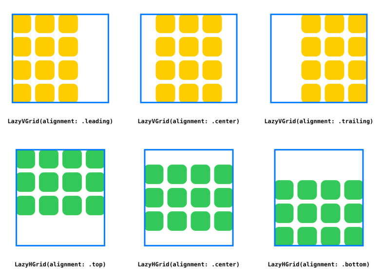
- alignment: Indicates how to place the contents of the grid. In most cases, this parameter will look like it’s doing nothing. Its use is only evident when a LazyVGrid is wider than it needs to be to accommodate all the columns, or a LazyHGrid is taller than it needs to be to accommodate all the rows. See the images below.
- spacing: For a LazyVGrid it is the spacing between the rows, for a LazyHGrid it is the spacing between the columns.
- pinnedViews: An OptionSet to indicate which views are pinned in the scroll view bounds. At the time of this writing, only Section header and footer views can be pinned. However, the words Apple chose for their documentation is generic enough to hope that one day we will be able to pin specific cells too. For the time being, however, you can specify: .sectionHeaders, .sectionFooters, or both: [.sectionHeaders, .sectionFooters]. We will see an example with pinned sections headers later.
- content: A ViewBuilder that provides all the views in the grid (i.e., cells). We typically use a ForEach.
GridItem
When dealing with LazyVGrid, the GridItem determines column properties (i.e., size, spacing, and alignment). The same applies to LazyHGrid, where GridItem is used for row properties.
Let’s look at its signature:
GridItem.init(_ size: GridItem.Size = .flexible(), spacing: CGFloat? = nil, alignment: Alignment? = nil)In LazyVGrid, spacing is used to specify the gap between this and the next column. In LazyHGrid spacing is used to specify the gap between this and the next row.
The alignment determines how our cell view will be positioned in the area offered by the grid. In most cases, we tend to use all the space offered, so this parameter may seem like it is doing nothing. But down below, in section “Anatomy of a Grid”, we will see how that is not the case.
The size parameter is an enum type, that will probably leave you scratching your head more than once. Here we have its declaration:
public struct GridItem {
    public enum Size {
        case fixed(CGFloat)
        case flexible(minimum: CGFloat = 10, maximum: CGFloat = .infinity)
        case adaptive(minimum: CGFloat, maximum: CGFloat = .infinity)
    }
}
Let’s start with the easiest. Each case adds a little more complexity than the previous, so we must analyze them in order:
- fixed(value): This one is simple, it provides a single value that will determine the exact width of a column in LazyVGrid, or the height of a row in LazyHGrid.
- .flexible(minimum:maximum:): In this case, for LazyVGrid, the following computation will take place to determine the column’s width:
let gw = [grid's width]
let af = [sum of all fixed columns widths]
let sp = [spacing]
let nc = [number of non-fixed columns]

let unclamped_width = (gw - (af + sp)) / nc

let column_width = min(max(unclamped_width, minimum), maximum)
For LazyHGrid, the computation is similar:
let gh = [grid's height]
let af = [sum of all fixed rows heights]
let sp = [spacing]
let nr = [number of non-fixed rows]

let unclamped_height = (gh - (af + sp)) / nr

let row_height = min(max(unclamped_height, minimum), maximum)- .adaptive(minimum:maximum): in this final case, for LazyVGrid, a single GridItem may represent more than one column. First, the framework determines how much space will be given to this GridItem, and then it decides how many columns it will create there. SwiftUI will try to fit as many minimum width columns as possible, but once the number of columns is determined, these can grow up to the maximum width provided, so it fills the full space. The method to determine how much space will be given to this GridItem is the same used for the .flexible() case (without the clamping).
Although it is good to describe the behavior formally, I usually learn these concepts better if I do it visually. For that, I have created a small example called GridTrainer. In addition to improving your learning curve, it will expose some bugs in the Grid implementation. At the moment, not all column combinations work as they should. Especially when the more complex cases are involved and they are competing for scarce space. By playing with the trainer, you may eventually come across one of these bugs. Fortunately, they are not so frequent.
You can get the Xcode project here: https://github.com/swiftui-lab/GridTrainer, I recommend you use a large screen iPad Pro, so you have more space to play.
You will notice that changing the alignment of the GridItems will have no effect. This is because the cells are taking all the space offered by the Grid. If you force the size of the cells to be something different, you will see how the alignment then makes a difference.
In the Toolbar, there is also a refresh icon. As mentioned, although Lazy*Grid works pretty well, it still has some bugs. From time to time it may start doing weird layouts, especially if its width is continuously changed. The refresh button simply destroys the grid and recreates it. Pressing the refresh button will not change any of your settings so most of the time will have no visual effect.
Anatomy of a Grid
Now that we have introduced all the parameters that constitute a Grid, it’s time to write some code:
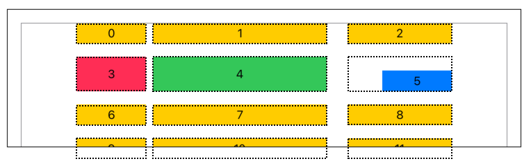
The code below produces the grid above. The dotted line was added after, to show the frame being offered by the grid to each cell. This little example teaches us a lot. Let’s begin:
- The height of a row in a LazyVGrid is driven by the height of the tallest cell. For example in the second row, the green view is the tallest, which makes the grid offer the same height to the other views in the same row. View #3 does not specify a height, and since shapes take as much as possible, it grows to occupy the full height. View #5, however, defines its own frame. Since it doesn’t match the offered space, it aligns according to the alignment parameter in the GridItem of the corresponding column (bottomTrailing). We will exploit this idea later when we build our honeycomb grid, or when we build a grid with a spanning cell.
- The alignment parameter in LazyVGrid is responsible for the group of cells centering as a whole. If we were to change the alignment to .leading, the whole group of cells will be pushed to the left.
- The space between the first and second columns is determined by the first GridItem (10). The space between the second and the third column is set by the second GridItem (30). The spacing value of the last GridItem is ignored.
- The space between the rows is determined by the spacing parameter in the LazyVGrid initializer (20)
struct ContentView: View {
    let gridItems = [
        GridItem(.fixed(100.0), spacing: 10.0, alignment: .top),
        GridItem(.fixed(250.0), spacing: 30.0, alignment: .center),
        GridItem(.fixed(150.0), spacing: 10.0, alignment: .bottomTrailing),
    ]

    var body: some View {
        ScrollView(.vertical) {
            LazyVGrid(columns: gridItems, alignment: .center, spacing: 20) {

                ForEach(0..<100) { idx in
                    VStack {
                        if idx == 3 {
                            Rectangle().fill(Color.pink)

                        } else if idx == 4 {
                            Rectangle().fill(Color.green)
                                .frame(height: 50)

                        } else if idx == 5 {
                            Rectangle().fill(Color.blue)
                                .frame(width: 100, height: 30)

                        } else {
                            Rectangle().fill(Color.yellow)
                                .frame(height: 30)

                        }
                    }.overlay(Text("\(idx)"))
                }
            }
            .border(Color.gray)
            .frame(width: 700)
            .padding(20)
        }
        .frame(height: 200)
        .border(Color.black)
    }
}
The Impossible Begins
LazyVGrid does not have a column span feature. That is, each cell view normally stays in the assigned width of the column. However, with just a little bit of work, we can achieve a result like the one shown in the image below, where one of the cells spans the space of two columns.

Let’s look at how the code works:
struct ColSpanExample1: View {
    var body: some View {
        let gridItems = [GridItem(.fixed(150), spacing: 10, alignment: .leading),
                         GridItem(.fixed(150), spacing: 10, alignment: .leading),
                         GridItem(.fixed(150), spacing: 10, alignment: .leading)]

        LazyVGrid(columns: gridItems, spacing: 10) {
            ForEach(0..<8) { idx in

                Image("\(idx % 15)")
                    .resizable()
                    .frame(width: idx == 4 ? 310 : 150, height: 150)

                if idx == 4 { Color.clear }

            }
        }
        .frame(width: 470)
    }
}
Two things can be learned from the code above. First, although the grid proposes a size to the child view (cell), the cell can ignore it. In this case, we are letting the image grow to twice the cell’s width (plus the spacing). The other important fact is that the grid has no idea this is happening, so it will still place the next image as usual. To avoid this overlapping, we must create a transparent bogus view that takes that place… and then everyone’s happy.
If we are going to use this often, we could have a little helper view like this:
struct ColSpan<Content: View>: View {
    let span: Bool
    let content: () -> Content

    init(span: Bool, @ViewBuilder content: @escaping () -> Content) {
        self.span = span
        self.content = content
    }

    var body: some View {
        content()

        if span { Color.clear }
    }
}
And then use it like this:
ForEach(0..<8) { idx in

    ColSpan(span: idx == 4) {
        Image("\(idx % 15)")
            .resizable()
            .frame(width: idx == 4 ? 310 : 150, height: 150)
    }

}
After looking at the code, you may have the feeling that I cheated a little. After all, this is a perfect scenario where we know exactly the width, the spacing, and the number of columns. But what happens if we are using .flexible() columns where the widths are unknown to us. Or worst, if we use .adaptive() columns, where we don’t even know the number of columns. Well, fear not. Although Lazy*Grid views are sneaky in their inner workings, we have our little spies that can give us all sorts of useful information about the grid’s layout. We’ll learn more about it in the final section (An Army of Spies). But before that, let’s continue to explore this concept of having views that do not bound themselves to what the grid offers. A great example of that is the honeycomb, so let’s build one next.
A Honeycomb Grid
The honeycomb conjecture states that a regular hexagonal grid is the best way to divide a surface into regions of equal area with the least total perimeter. The conjecture was around for two millennia, but it was proved only recently, by mathematician Thomas C. Hales in 1999.
Now it’s time to create our honeycomb grid. At first, it may look like there is a lot of code involved, but fortunately, that is not the case. As we learned already, the grid proposes a size and location for each of our cell views. However, cells can take that proposal only as a reference and can decide to draw outside the designated area. Also in our favor, the cell decides the height of the row.
But let’s begin with our RegularGrid as a starting point:
struct RegularGrid: View {
    let cols: Int = 6
    let spacing: CGFloat = 10
    let imgsize = CGSize(width: 150, height: 150)

    var body: some View {
        let gridItems = Array(repeating: GridItem(.fixed(imgsize.width), spacing: spacing), count: cols)

        ScrollView(.vertical) {
            LazyVGrid(columns: gridItems, spacing: spacing) {
                ForEach(0..<200) { idx in
                    Image("image-\(idx % 15)")
                        .resizable()
                        .frame(width: imgsize.width, height: imgsize.height)
                }
            }
        }
    }
}
Now, to achieve the honeycomb look, we simply need to clip the images with a hexagon shape, manipulate some frames, and some offsets. That’s all. The following animation shows how these changes let us go from a boring regular grid, to the coolest grid in nature: the honeycomb.
Full disclosure on the animation. I included it here, so you better understand what are the steps to go from a standard grid to the honeycomb look. However, at least as of beta 3, animating these changes does not work very smoothly. The main problem is that as a side effect of the change in the grid, some cells that are rendered in one look, may not be rendered in the other (they scroll off the screen). Since grids are lazy, these views are removed from the hierarchy. That is not a problem, however, for some reason, SwiftUI animates the removal of these views, by sliding them down (and it doesn’t look nice).
Here’s the code for the honeycomb grid. It’s not long (as promised). We will discuss the changes below.
struct Honeycomb: View {
    let cols: Int = 6
    let spacing: CGFloat = 10
    let imgsize = CGSize(width: 150, height: 150)
    var hexagonWidth: CGFloat { (imgsize.width / 2) * cos(.pi / 6) * 2 }

    var body: some View {
        let gridItems = Array(repeating: GridItem(.fixed(hexagonWidth), spacing: spacing), count: cols)

        ScrollView(.vertical) {
            LazyVGrid(columns: gridItems, spacing: spacing) {
                ForEach(0..<200) { idx in
                    VStack(spacing: 0) {
                        Image("image-\(idx % 15)")
                            .resizable()
                            .frame(width: imgsize.width, height: imgsize.height)
                            .clipShape(PolygonShape(sides: 6).rotation(Angle.degrees(90)))
                            .offset(x: isEvenRow(idx) ? 0 : hexagonWidth / 2 + (spacing/2))
                    }
                    .frame(width: hexagonWidth, height: imgsize.height * 0.75)
                }
            }
            .frame(width: (hexagonWidth + spacing) * CGFloat(cols-1))
        }
    }

    func isEvenRow(_ idx: Int) -> Bool { (idx / cols) % 2 == 0 }
}
As you can see, it’s just a few lines of code. Let’s analyze the changes:
- First, we clip our images with a hexagon shape (line #17).
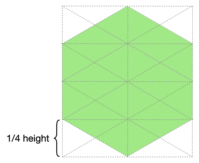
- Then we wrap our images inside a VStack (indicated with a dashed line in the animation). This VStack will have a height 25% shorter than the actual image. This means, that the image will overflow. Why 25%? That is how much we need to overlap the rows. It can be easily understood visually by looking at the picture below. We also need to adjust the cell’s width to match the hexagon’s width (which is a little smaller than the picture). The math for computing the hexagon’s width is explained down below. (lines #13, #19, and #20)
- Odd rows will be shifted to the right (line #18).
- And finally, we need to crop the grid, so the blank spaces produce by the row shifting does not look ugly (line #23).
When looking at the code, you may see a tiny bit of trigonometry (sorry, I can’t avoid it). It is necessary to work out the hexagon’s width. But don’t worry, it’s not hard. It seems those clever bees had it all figured out.
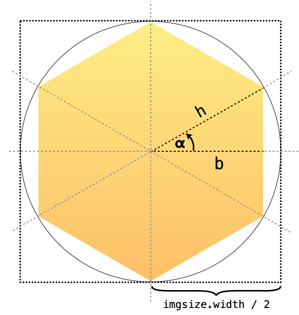
Observing at the picture, we can see that the hexagon’s width is twice the size of the “leg b” of the triangle. We know that h (hypotenuse) is equal to the radius of the circle, which happens to be half the size of the rectangle (imgsize.width / 2). Finally 𝝰 (alpha), is 360/12 (or .pi / 6 in radians). We already know that cos(𝝰) = leg b / hypotenuse, and since we are looking for 2 * b:
let hexagonWidth = (imgsize.width / 2) * cos(.pi / 6) * 2I know those “twos” can be removed from the equation and leave imagesize.width * cos(.pi/6), but I like to keep them there to remember where the number came from.
Ok, so we did it… but wait, there is a little more code you need to use. But this is an old friend of ours, and we know it well from previous articles: PolygonShape. We need this shape view to clip the image. Here it is again:
struct PolygonShape: Shape {
    var sides: Int

    func path(in rect: CGRect) -> Path {
        let h = Double(min(rect.size.width, rect.size.height)) / 2.0
        let c = CGPoint(x: rect.size.width / 2.0, y: rect.size.height / 2.0)
        var path = Path()

        for i in 0..<sides {
            let angle = (Double(i) * (360.0 / Double(sides))) * Double.pi / 180

            let pt = CGPoint(x: c.x + CGFloat(cos(angle) * h), y: c.y + CGFloat(sin(angle) * h))

            if i == 0 {
                path.move(to: pt) // move to first vertex
            } else {
                path.addLine(to: pt) // draw line to next vertex
            }
        }

        path.closeSubpath()

        return path
    }
}
An Army of Spies
The Section view let us provide one view for the header and another for the footer. A very common requirement is that each column has its own header. However, the grid only accepts a single view for the entire grid’s width. To solve this, we simply create an HStack, and inside of it, we place each of the column headers, with padding between them, equal to the spacing of the columns. That is great, as far as all columns have a .fixed size. Luckily, there’s a way out when that’s not the case.
By now, we’ve seen that Lazy*Grid does a lot of work for us. They decide how many columns/rows to place and also their widths/heights. However, grids do all that without reporting back to us. How dare they! This means that if we want to make a decision based on the number of columns, or their position, we are out of luck… well, not exactly.
Fortunately, we have our little army of spies that can give us all sorts of valuable information about the grid’s layout. I’m talking about the cells! They are in a privileged position to help. And when we put together all the information that each view provides individually, we can work out even more information.
Back to our header example, this technique will help us achieve something like this:
Below is the code that lets us have adjustable headers. It uses two modifiers that I’ve implemented (<strong>.gridInfoId()</strong> and <strong>.gridInfo()</strong>). Their code will be revealed further down, but for the time being, let’s look at how we use them.
struct ExampleView: View {
    @State private var gridWidth: CGFloat = 800
    @State private var info: GridInfo = GridInfo()

    var body: some View {
        let gridItems = [GridItem(.adaptive(minimum: 100, maximum: .infinity), spacing: 10)]

        VStack {
            ScrollView(.vertical) {
                LazyVGrid(columns: gridItems, spacing: 10, pinnedViews: .sectionHeaders) {
                    Section(header: HeaderView(info: self.info)) {
                        ForEach(0..<200) { idx in
                            Image("image-\(idx % 15)")
                                .resizable()
                                .frame(height: info.cellWidth(idx))
                                .gridInfoId(idx)
                        }
                    }
                }
                .frame(width: gridWidth)
                .gridInfo($info)
            }

            Slider(value: $gridWidth, in: 0...1500)
        }
    }

}
And here is the HeaderView:
struct HeaderView: View {
    let info: GridInfo

    var body: some View {
        HStack(spacing: 0) {
            ForEach(0..<info.columnCount) { colIdx in
                RoundedRectangle(cornerRadius: 8)
                    .fill(Color.gray.opacity(0.7))
                    .frame(width: info.columnWidth(colIdx))
                    .overlay(Text("Column \(colIdx + 1)"))
                    .padding(.trailing, info.spacing(colIdx))
            }
            // Force ForEach to redraw when columnCount changes.
            // Not best solution, but good enough for this example.
            .id(info.columnCount)
        }
        .frame(maxWidth: .infinity, alignment: .topLeading)
        .frame(height: 40)
    }
}
Each of our cells is enrolled as one of our spies, by calling gridInfoId() on them. We then add gridInfo() to our LazyVGrid, which will be responsible for collecting everything into a single variable (info).
Now, info contains all the sizes and positions of the rendered views, using the LazyVGrid coordinate space. It also has some helpful computed properties and functions. For example, info.columnWidth(), or info.columnCount.
Note that since our images are square, we also use the info.cellWidth() to reset the height of our images. This ensures that the height matches the width of the columns at all times.
So how does all this happen? The answer is actually quite simple. Say hello to our savior, once again: Preferences! If you want to learn more about preferences, check the article series: Inspecting the View Tree.
Here’s the implementation of both methods:
struct GridInfoPreference {
    let id: Int
    let bounds: Anchor<CGRect>
}

struct GridPreferenceKey: PreferenceKey {
    static var defaultValue: [GridInfoPreference] = []

    static func reduce(value: inout [GridInfoPreference], nextValue: () -> [GridInfoPreference]) {
        return value.append(contentsOf: nextValue())
    }
}

extension View {
    func gridInfoId(_ id: Int) -> some View {
        self.anchorPreference(key: GridPreferenceKey.self, value: .bounds) {
                [GridInfoPreference(id: id, bounds: $0)]
            }
    }

    func gridInfo(_ info: Binding<GridInfo>) -> some View {
        self.backgroundPreferenceValue(GridPreferenceKey.self) { prefs in
            GeometryReader { proxy -> Color in
                DispatchQueue.main.async {
                    info.wrappedValue.cells = prefs.compactMap {
                      GridInfo.Item(id: $0.id, bounds: proxy[$0.bounds])
                    }
                }

                return Color.clear
            }
        }
    }
}
And the GridInfo with all its helpers:
struct GridInfo: Equatable {
    // A array of all rendered cells's bounds
    var cells: [Item] = []

    // a computed property that returns the number of columns
    var columnCount: Int {
        guard cells.count > 1 else { return cells.count }

        var k = 1

        for i in 1..<cells.count {
            if cells[i].bounds.origin.x > cells[i-1].bounds.origin.x {
                k += 1
            } else {
                break
            }
        }

        return k
    }

    // a computed property that returns the range of cells being rendered
    var cellRange: ClosedRange<Int>? {
        guard let lower = cells.first?.id, let upper = cells.last?.id else { return nil }

        return lower...upper
    }

    // returns the width of a rendered cell
    func cellWidth(_ id: Int) -> CGFloat {
        columnCount > 0 ? columnWidth(id % columnCount) : 0
    }

    // returns the width of a column
    func columnWidth(_ col: Int) -> CGFloat {
        columnCount > 0 && col < columnCount ? cells[col].bounds.width : 0
    }

    // returns the spacing between columns col and col+1
    func spacing(_ col: Int) -> CGFloat {
        guard columnCount > 0 else { return 0 }
        let left = col < columnCount ? cells[col].bounds.maxX : 0
        let right = col+1 < columnCount ? cells[col+1].bounds.minX : left

        return right - left
    }

    // Do not forget the "Equatable", as it prevent redrawing loops
    struct Item: Equatable {
        let id: Int
        let bounds: CGRect
    }
}
Summary
Congratulations on making it to the end! In this (long) article, we have learned how with just a little bit of imagination, Lazy*Grid let us create some views that go beyond the standard regular grid.
Please feel free to comment below, and follow me on twitter if you would like to be notified when new articles come out. Until next time!
Very nice article which is well-written and understandable. If I wanted to use a tab gesture to select one the the grid cells, what would I do?
I suppose you mean tap gesture, not tab gesture. If that is the case, note that Lazy*Grids do not have selection support, but you can implement this yourself by adding onTapGesture to your cell views, use the closure to set some kind of selection state, and use that to reflect it in the look of the selected cell.
Hi Thanks for this article!
Can we use LazyVGrid in place of List where very large dataset is involved? Since with Grids the state is retained as you have mentioned will it take lot of memory?
You will have to do some testing. It very much depends on your data set and what kind of state data your views have.
very good article
Is there any way to get ride of selection style of gridItem ?
Great job!
The author doesn’t only know how to write code, but also how to explain code. This work deserves a beer!
some typos:
spacing: 20 text vs 19 code
cols should be 6 in RegularGrid also
info.comunWidth() is misspelled
Fixed! Thank you!
Thank you for this article to explain different more advanced usages! I’m wondering if it is possible to achieve this waterfall grid effect with lazygrad?
Is there a way to scroll horizontally and vertically? I have a very unique use case that requires both axis
Yes, you can use
to scroll in both directions.
Thank you so much!
What does “width: idx == 4” actually reference? I tried recreating this utilizing a Model and View Model I have, but could not get it to work. So, how does the grid know the particular image requires two or more cells?
The idx == 4 is there to make the 5th cell wider.
What if the two space columns image starts on the third column?
Hi Giovanni. You need to implement your own logic to prevent invalid layouts, but that is very specific to the data you are showing. The example here is a simple starting point.
Of course, thanks
Thank you very much for the profound, deep and fancy visualized explanations. I rate that with 5 stars.
What a great guid!
How can I make the Honeycomb Grid scroll horizontal
Yes, it’s possible, using the direction parameter in ScrollView
Thanks for sharing this.
Is there a way to get a seperator between each row of the grid?
I didn’t found a solution for this yet.
Lazy*Grid does not have a way of specifying a view as a separator. Only a spacing size.
With that in mind, you could use the techniques described in the article to achieve a separator. Some ideas, although none of them are pretty:
1. After each row, you could have an extra row with a column spanning all positions.
2. You could use preferences to learn about the layout of your grid and overlay the separators appropriately.
3. You may also overlay over the view in each first column cell, with an offset and an altered frame.
Good luck!
Say you have a grid that scrolls horizontally and vertically is there a way to lock said grid in place? For example if there was a toggle for lock and release?
Anyone please?
Hi Brent, one idea that comes to mind, is using an interfering gesture. It is known by now, that gestures on a scrollable view interfere with the scroll gesture. By adding a gesture only while you want the scroll locked, will have that effect. Gestures can be easily enabled/disabled, using the including parameter. Here’s an example:
I don’t know if this will solve your problem, but perhaps it’s a starting point. Cheers.
I’m going to test this out right now! Thank you so much!
There seems to be different behaviour in iOS 15, because LazyVGrid doesn’t seem to offer the full height to smaller cells.
If I run your “Anatomy of a grid” example in a playground, then the red cell (number 3) doesn’t occupy the full height.
I’d love to hear your thoughts on this @javier! Is it possible to make the red cell, which doesn’t specify a height, occupy the full height of the row?
It seems you are right about that iOS14/iOS15 discrepancy. It deserves raising a bug with Apple. I’ll update the post shortly. Thanks for pointing it out!
Great article!
In my situation I want to be able to have a cell that spans multiple columns and multiple rows.
Something like this:
======
| | | Field A |
| photo | | Field B |
| | | Field C |
=======
| Field D |
I wonder if something like that would be possible?
And what about Drag & Drop? Would it be possible to drag the cells around even thought the layout is more complex than a regular grid? For example, if I wanted to drag my photo to display on the right side, the 3 fields on the right should move to the left.
Thanks!
OOps. didn’t format nicely.
Basically a Photo to appear on the left in a box in one cell, and 3 fields to appear to the right, and one field to appear below the photo and the fields spanning the photo and the fields columns. So the photo takes up 2 columns and 2 rows. The fields take up one column and one row each, aligned to the right of the photo. And another field stretched below the photo and 3 fields.
Sorry for the delayed reply. I think for such a scenario, even if it “could” be accomplished with grids, the code will end up being very hard to read (and maintain).
Thanks for this awesome tutorial, it helped me a lot already., I have one thing i still can‘t figure out:
I do have a LazyVGrid with a few columns that i always need. After that i do have a few additional columns – that might appear or not (basically an array with a few elements), so:
Fixed(100) | Fixed(120) | Fixed(150) | ArrayElement1(120) | ArrayElement2(120) | ArrayElement3(120)…
The amount of ArrayElements is not set and changes while the view is active.
How would i solve this?
I sent you an email a few days ago, but in case you did not get it, here’s a way to achieve what you are looking for:
Hi Javier,
thanks for your email, just found it
Works perfectly and is exactly what I needed. Indeed in my array I have an element that stores the width of the column and the title – so it was easy to adapt! Thanks again!
Jonas
Amazing article and code, thanks!
I now am a master of Grids :}
(As a beginner i am ) I just were looking the way to create table. And found “table” but it turned out to be only available for MacOs 12+. And then i found your article. It is just so well explained that no other words THANK YOU SO MUCH for knowledge sharing.