This year brought some interesting new additions to the SwiftUI framework. There is one, in particular, that opens a whole lot of new possibilities. We are talking about a new extension to the View protocol, the .matchedGeometryEffect() modifier. On its own, it’s good enough, but in combination with other techniques we learned already (custom transitions and animatable modifiers), it becomes even better. It is an essential skill to put in your SwiftUI toolkit.
One Method, Two Use Cases
This single modifier is, in reality, two modifiers in one. It can perform two very distinctive tasks. They are so different, that I have decided to split this article into two parts.
Use Case #1: We use .matchedGeometryEffect() to synchronize the geometries (size and/or position) of two views. One view is being inserted into the view hierarchy, and the other one is leaving. We will explore this mode in this first part of the article.
Use Case #2: We use .matchedGeometryEffect() to synchronize the geometries (size and/or position) of several views that are concurrently part of the view hierarchy. In part 2, we see this case in detail.
Make your views fly!
In the first use case, one view is removed from the view hierarchy, while another is simultaneously inserted. This is ideal for creating “Hero Animations”. You know…, those fancy animations where one element from one area of the screen “flies” like Superman, and then lands and integrates into a different area of the screen. Here’s an example that, once you reach the end of the article, you will be in a position to build yourself. But don’t worry, I’ll also include the code if you just want to copy and paste
Before we create a Hero Animation like the one showcased above, we need to build our concepts gradually. Let’s get to work.
The Building Blocks of a Hero Animation
We begin by creating two mutually exclusive views. When one is inserted into the hierarchy, the other is removed:

struct ExampleView: View {
    @State private var flag: Bool = true

    var body: some View {
        HStack {
            if flag {
                Rectangle().fill(Color.green).frame(width: 100, height: 100)
            }

            Spacer()

            Button("Switch") { flag.toggle() }

            Spacer()

            if !flag {
                Circle().fill(Color.blue).frame(width: 50, height: 50)
            }
        }.frame(width: 400)
    }
}
When you press on the “Switch” button, one shape disappears and the other appears instantaneously. However, for our example, we need an animation in place. To do so, we update our button action:

Button("Switch") {
    withAnimation(.easeInOut(duration: 2.0)) { flag.toggle() }
}
Ok. Looking better. Now, when there’s an animation triggering the insertion/removal, SwiftUI uses its default transition to fade-in one shape, and fade-out the other. This is nice, but both views are still disconnected. It’s time to introduce .matchedGeometryEffect. Let’s see its function signature:
func matchedGeometryEffect<ID>(id: ID, in namespace: Namespace.ID, properties: MatchedGeometryProperties = .frame, anchor: UnitPoint = .center, isSource: Bool = true) -> some View where ID : HashableFor now, we are only interested in the three first parameters. The rest will be left at their defaults and we’ll cover them later.
- id: Since the method can synchronize the geometries of different groups of views, the id parameter is what lets us group them accordingly. It can be any Hashable type (e.g., Int, String, whatever you fancy).
- namespace: This one may be a little more confusing. Apple’s documentation says a lot, without saying much. However, after experimenting a little, we understand that it is a way for the framework to not confuse two groups of views with the same id. It could happen that the same id is used in multiple views of the hierarchy. In order to avoid id collision, a pairing of two views is determined by the id+namespace. Fortunately, its use is very formulaic, as you will learn from the examples. It only requires you to define a variable with the @Namespace property wrapper, and you’re good to go. There are some other uses, those are explored in Part 2.
- properties: This indicates if we want to match the size (.size), the position (.position) or both (.frame). If we do not specify anything, it will match both.
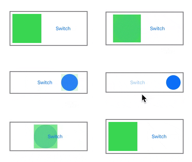
But enough talk. Let’s see it in action. In the code below, we link both views with a call to .matchedGeometryEffect(). Now it looks more as if the outgoing view is “becoming” the incoming view and vice-versa.

struct ExampleView: View {
    @Namespace var nspace
    @State private var flag: Bool = true

    var body: some View {
        HStack {
            if flag {
                Rectangle().fill(Color.green)
                    .matchedGeometryEffect(id: "geoeffect1", in: nspace)
                    .frame(width: 100, height: 100)
            }

            Spacer()

            Button("Switch") { withAnimation(.easeInOut(duration: 2.0)) { flag.toggle() } }

            Spacer()

            if !flag {
                Circle()
                    .fill(Color.blue)
                    .matchedGeometryEffect(id: "geoeffect1", in: nspace)
                    .frame(width: 50, height: 50)
            }
        }
        .frame(width: 250).padding(10).border(Color.gray, width: 3)
    }
}
This is what SwiftUI is doing:
- The view being inserted starts with the size and position of the view being removed. During the transition, however, its size and position animate to reach the place where it was supposed to be.
- The view being removed does the opposite. It starts with its own size and position, and during the transition, it animates to the final size and position of the view being inserted.
- By default, the incoming view fades-in, and the outgoing view fades-out.
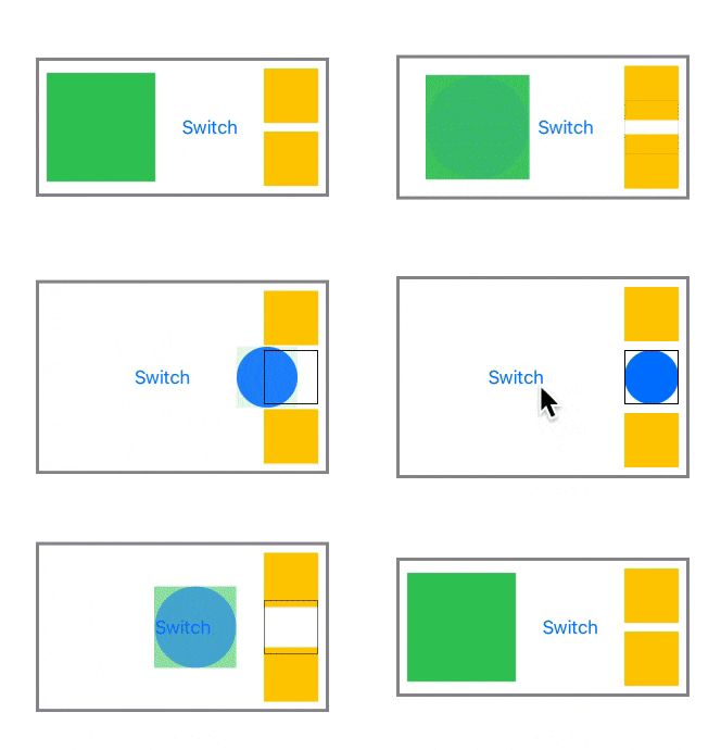
Let’s repeat the example, but we will add some views surrounding the circle, to see how they react. We will also add a rectangle after the .matchedGeometryEffect() call of the inserted circle. This will give us a better understanding of what is going on:

VStack {
    Rectangle().fill(Color.yellow).frame(width: 50, height: 50)

    if !flag {
        Circle()
            .fill(Color.blue)
            .matchedGeometryEffect(id: "geoeffect1", in: nspace)
            .frame(width: 50, height: 50)
            .border(Color.black)
            .zIndex(1)
    }

    Rectangle().fill(Color.yellow).frame(width: 50, height: 50)
}
Better Transitions
With what we’ve seen so far, we can already start to make nice transitions between two views. The real power, however, comes when we combine .matchedGeometryEffect() with custom transitions and animatable modifiers. If you don’t know what they are, you may learn more about them in these two previous posts:
The idea is simple, but the effects are powerful. The geometry match that we have described here, occurs during the transition when the views are being added and removed. This means that if we add a custom transition, we can make our outgoing view to morph into the shape of the incoming view, and vice-versa. When I say “morph into the shape”, I am speaking broadly. It doesn’t have to be the shape necessarily.
For example, you may have two identical images, and with the same size. However, each may be cropped differently. The transition is a good time to animate the cropping from one image to the other. The result, a smooth transition. We’ll see that in more detail with the “Hero Animation” example. But first, let’s see how its elemental components fit together.
We are going to borrow some code from the Advanced Animations Part 1 post. We’ll use the PolygonShape shape, which let us draw a polygon with a specified number of sides. Will fit it into a view that will get the number of sides from a custom Environment Key called .polygonSides. When the number of sides is >= 30, it will draw a circle instead (they are almost identical, but the circle looks smoother).
struct Polygon: View {
    @Environment(\.polygonSides) var sides: Double
    let color: Color

    var body: some View {
        Group {
            if sides >= 30 {
                Circle()
                    .stroke(color, lineWidth: 10)
            } else {
                PolygonShape(sides: sides)
                    .stroke(color, lineWidth: 10)
            }
        }
    }

    struct PolygonShape: Shape {
        var sides: Double

        func path(in rect: CGRect) -> Path {
            let h = Double(min(rect.size.width, rect.size.height)) / 2.0
            let c = CGPoint(x: rect.size.width / 2.0, y: rect.size.height / 2.0)
            var path = Path()
            let extra: Int = Double(sides) != Double(Int(sides)) ? 1 : 0

            for i in 0..<Int(sides) + extra {
                let angle = (Double(i) * (360.0 / Double(sides))) * Double.pi / 180

                let pt = CGPoint(x: c.x + CGFloat(cos(angle) * h), y: c.y + CGFloat(sin(angle) * h))

                if i == 0 {
                    path.move(to: pt) // move to first vertex
                } else {
                    path.addLine(to: pt) // draw line to next vertex
                }
            }

            path.closeSubpath()

            return path
        }
    }
}
We define our custom environment key:
extension EnvironmentValues {
    var polygonSides: Double {
        get { return self[PolygonSidesKey.self] }
        set { self[PolygonSidesKey.self] = newValue }
    }
}

public struct PolygonSidesKey: EnvironmentKey {
    public static let defaultValue: Double = 4
}
Now we create two custom transitions. One to animate the environment value .polygonSides from 3 to 30, and the other from 30 to 3:
extension AnyTransition {
    static var polygonTriangle: AnyTransition {
        AnyTransition.modifier(
            active: PolygonModifier(sides: 30, opacity: 0),
            identity: PolygonModifier(sides: 3, opacity: 1)
        )
    }

    static var polygonCircle: AnyTransition {
        AnyTransition.modifier(
            active: PolygonModifier(sides: 3, opacity: 0),
            identity: PolygonModifier(sides: 30, opacity: 1)
        )
    }

    struct PolygonModifier: AnimatableModifier {
        var sides, opacity: Double

        var animatableData: Double {
            get { sides }
            set { sides = newValue }
        }

        func body(content: Content) -> some View {
            return content
                .environment(\.polygonSides, sides)
                .opacity(opacity)
        }
    }
}
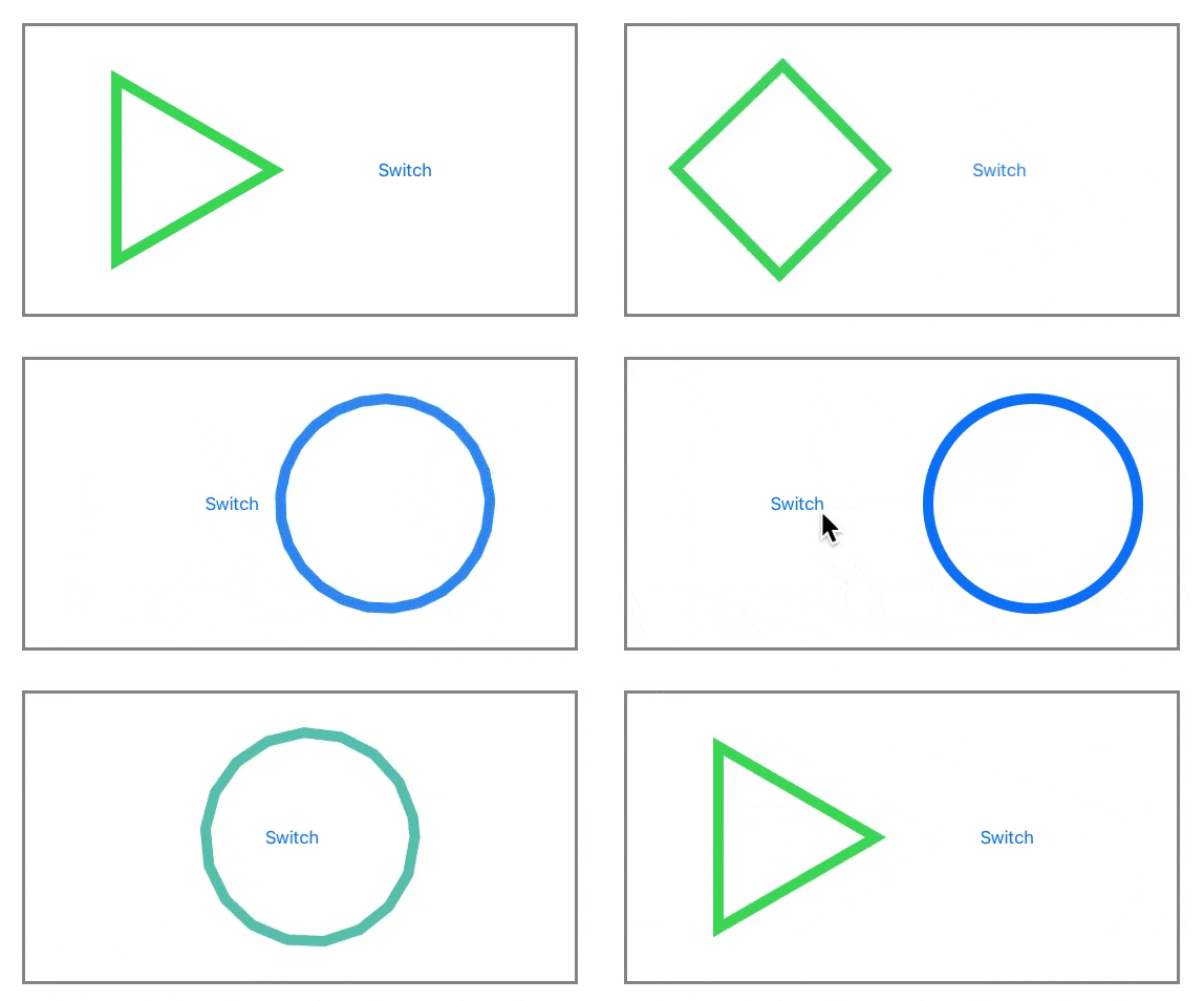
And now we put it all together. When we remove one view, and add the other, it transitions from triangle to circle, and vice-versa. It seems to be a single view animating. But there are two, it’s just that they are identical at all times. One is always green, the other is always blue, but since their opacities progressively change, the color also transitions smoothly.

struct ExampleView: View {
    @Namespace var nspace
    @State private var flag: Bool = true

    var body: some View {

        HStack {
            if flag {
                VStack {
                    Polygon(color: Color.green)
                        .matchedGeometryEffect(id: "geoeffect1", in: nspace)
                        .frame(width: 200, height: 200)
                }
                .transition(.polygonTriangle)
            }

            Spacer()

            Button("Switch") { withAnimation(.easeInOut(duration: 2.0)) { flag.toggle() } }

            Spacer()

            if !flag {
                VStack {
                    Polygon(color: Color.blue)
                        .matchedGeometryEffect(id: "geoeffect1", in: nspace)
                        .frame(width: 200, height: 200)
                }
                .transition(.polygonCircle)
            }
        }
        .frame(width: 450).padding(40).border(Color.gray, width: 3)
    }
}
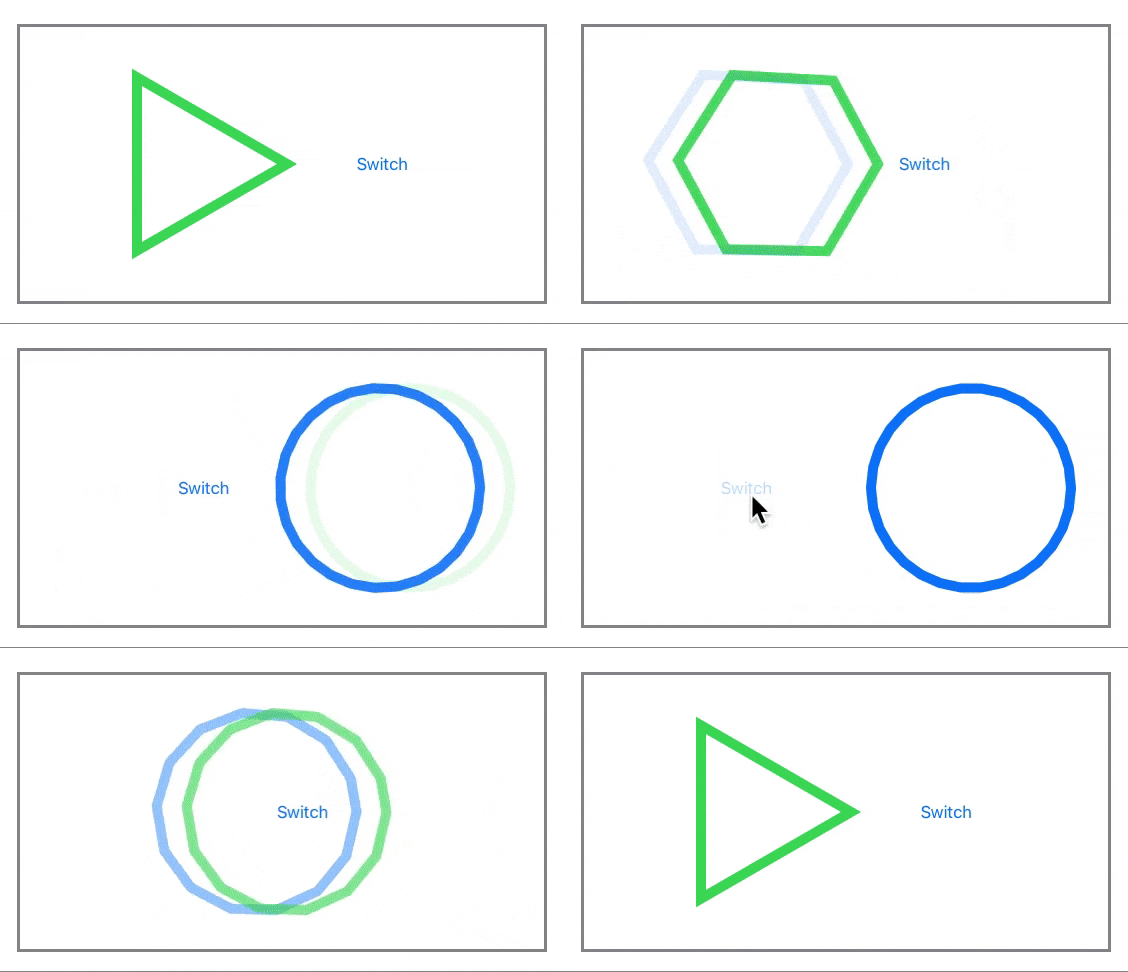
What am I hearing? You don’t believe me? Look what happen if we add a small offset to the first view:

Polygon(color: Color.green)
    .offset(x: 30)
    .matchedGeometryEffect(id: "geoeffect1", in: nspace)
    .frame(width: 200, height: 200)
The Hero Comes Flying In
With all we cover in this article, you already have the tools to build a hero animation. In the example, I will be using a couple of other iOS 14.0 features. These are LazyVGrid and ScrollViewReader. I will talk about them in more detail on future articles. However, these are not essential to understand the code of the project.
Since the code is larger than usual, I created an Xcode project. The link to its repository is below:
https://github.com/swiftui-lab/swiftui-hero-animations.git
Check the README.md file, which contains a guide on how to navigate the code. Note that although I tested the project on an iPad 9.7″ running at full screen, the code is design to easily adapt to any window size. You simply need to set the right values in the HeroConfiguration variable. In fact, the code does that already when the device is rotated. The HeroConfiguration is different for each orientation.
Note that when you use the panel to change the configuration, you affect the layout in the orientation that you are in.
Summary
In this article we have exposed one of the sides of the .matchedGeometryEffect() modifier. As you can see, it can be very powerful. You just need to get creative.
In the second part, we cover the other use case described in the introduction. Please feel free to comment below, and follow me on twitter if you would like to be notified when new articles come out. Until next time!


very cool Article, as always. Even when I think I already know about the subject, it’s always surprising what ideas you come up with!
Thank you! Glad you liked it.
Great article. This is the best information I’ve found on the “MatchedGeometryEffect”. Thanks for sharing your discoveries.
为何你如此牛逼!!!
Really good stuff! Thanks for presenting it so skillfully too.
Views could transition together across the view hiearchy.
Hello Javier, thank you so much for the article, it is really instructive.
I have a question after completing the tutorial using Xcode 12.1 and 12.2.
Is it normal that my views are not fading in whenever they are being inserted? The code I’ve written is exactly the same that the one in the tutorial but the only animation that works out of the box for me is fade out.
I have tried as well to specify directly the transition but even though it doesn’t work. Is it a bug in SwiftUI? Is someone else experiencing this issue?
Hi Sergio, there are many snippets in the article. Which one is not working for you? Are you using targeting iOS or macOS?
Targeting iOS, the snippet is this one where you have the circle and the rectangle and both of them are being animated while inserting or removing from the view.
In my case the fade out is working for removing but I don’t see any fade in for inserting. The code is exactly the same as the snippet.
Hi Sergio, it is working for me. Just in case, here’s my testing environment: Xcode 12.2 (12B45b), iPad Pro 12.9 inch 4th Gen, iOS 14.2.
To make sure we are both on the same page:
1. First switch (green rectangle on the left to blue circle on the right). Green rectangle fades out, blue circle fades in.
2. Second switch (blue circle on the right to green rectangle on the left). Blue circle fades out, green rectangle fades in.
Are you experiencing something different then?
I’m experiencing the same as Sergio using Xcode 12.2 (12B45b) – the fade-out happens as expected, but there’s no transition to fade-in: the square or circle simply appears directly when the button is clicked.
Great tutorial! I’ll experiment a while and see if there’s anything that can be done to fix the bug.
Hi Javier and Sergio
I realized that this is just a simulator bug: running the same code on a real device works as expected!
Really loving this site – thanks for all the great work!
Cool stuff. I have an old question open on Stackoverflow, that gets finally and elegantly answered with your explanation.
I‘ll link this side to my answer.
Great one again! You make me wonder if I could build a game without spritekit…
Why does this work: VStack {
Polygon(color: .blue)
.matchedGeometryEffect(id: “id”, in: namespace)
.frame(width: 100, height: 100)
}
.transition(.polygonTriangle)
but not this: Polygon(color: .blue)
.matchedGeometryEffect(id: “id”, in: namespace)
.frame(width: 100, height: 100)
.transition(.polygonTriangle)
Hi Javier,
Thank you very much for all your amazing articles. I am learning tremendously from them. They are so smartly written from applying trigonometry in Path, matrices in GeometryEffect to Grids and much more in other articles. I consider myself as a beginner, who admires your work and using them as my framework in advancing my knowledge in SwiftUI.
Since AnimatableModifier has been deprecated,
please excuse me for my ignorance, can you show me what changes in the coding for the example of transforming between circle and triangle without using AnimatableModifier? Thank you very much.